Sole UX/UI Designer
A mobile application designed to help pet owners quickly identify plants and determine whether they are safe to have around their pets.
Overview
The idea for the app came about when one of my friends hosted a wreath-making party and her cat started chewing on some juniper. We had no idea if it was safe for him or not, to be honest, we weren’t really 100% sure it was actually juniper… and we couldn't find any quick answers online.
Alas, Sniff&Sprout was born! It's a mobile app that makes it easy for pet owners to identify plants and find out if they're safe for their pets to be around (or chew on). This case study shows the process I went through to make sure the app really met the needs of pet owners.
My Role
Sole UX/UI Designer
Timeline & Status
Overall: 12+ weeks
Discovery & Research: 4+ weeks
Design & Testing: 8 weeks
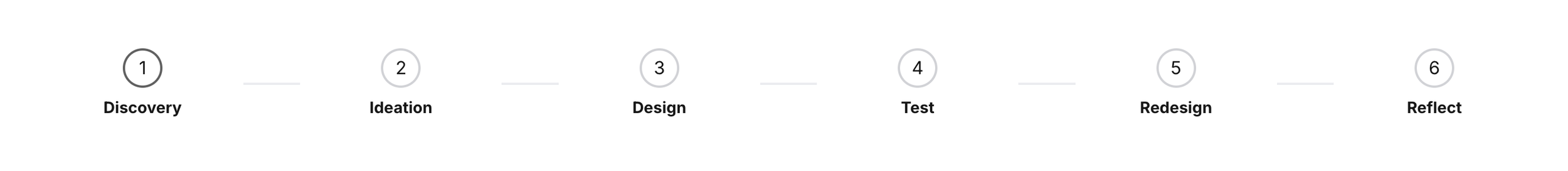
Process
User Research & Synthesize
Ideation
Sketch
UI Design & Prototype
Usability Test & Synthesize
Redesign
Discovery
Secondary Research
Through my secondary research, I discovered that many people have concerns about their pet's allergies and keeping plants in their homes. People think of their pets as part of their family, and plants are part of their home - and it is very common for the two to come into contact with each other.
Poison control centers receive thousands of calls every year regarding plant poisoning.
There are thousands of plants that can cause an allergic reaction in household pets, by contact or by inhalation.
Allergic reactions can vary in severity from itchy rashes to being fatal.
Veterinarians can assist, but it can be hard for them to help if you don’t know the name of the species of the plant your pet came into contact with.
Primary Research
Survey
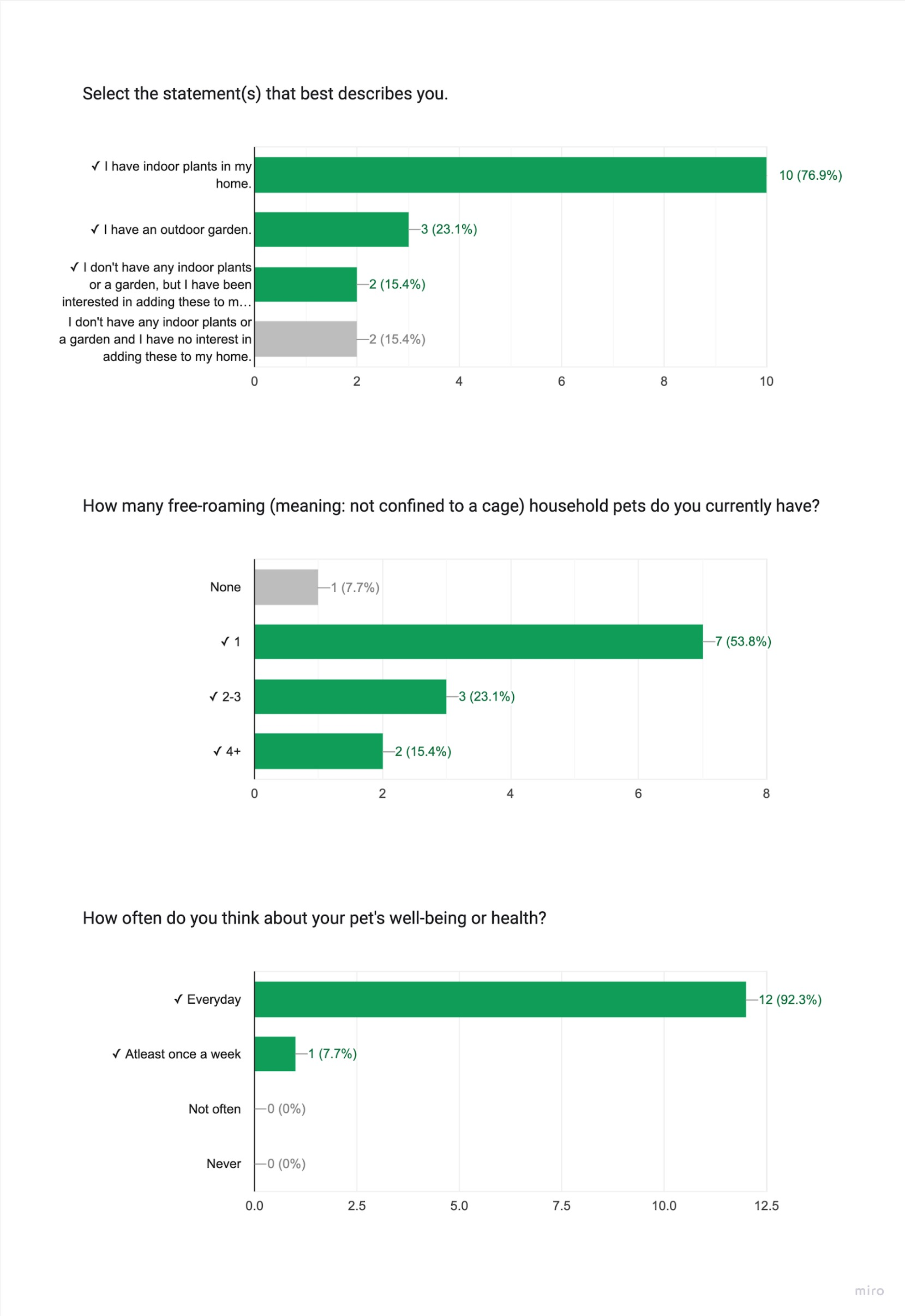
I wanted to find some people to interview about their pets and plants, and how they take care of them. To do this, I sent out a survey to find participants. I posted about it on Facebook and Instagram and also reached out to some of my contacts. The requirements I was looking for were that they had to have at least one free-roaming pet and either have some plants or be into plants.
I also snuck in a question to see how much they care about their pet's health - I wanted to make sure they were the right fit for my app idea. I figured that if someone didn't really care or worry about their pet's health, then they wouldn't be interested in using an app to help take care of them. Out of the 13 people who took the survey, 11 were qualified.
1. People care deeply for their pets.
Interviews
After conducting the survey to gather participants, I talked to 5 pet owners who either had plants at home or were keen on getting some.
Through these interviews, I got a much better understanding of their needs, pain points, behaviors, and aspirations. It really helped me see things from their angle, and helped get me started on brainstorming ideas to design a product that would make their lives easier and more fun! The interviews gave me valuable insight into pet owners' brains, 3 recurring themes that pet owners brought up were…
3. Contacting their vet isn't a simple solution.
Affinity Maps
I used affinity mapping to sort and summarize the data I got from talking to the the pet owners. Organizing the information this way gave me great snapshot of all of the information and helped me spot patterns. It was super helpful in seeing the big picture and identifying key takeaways.
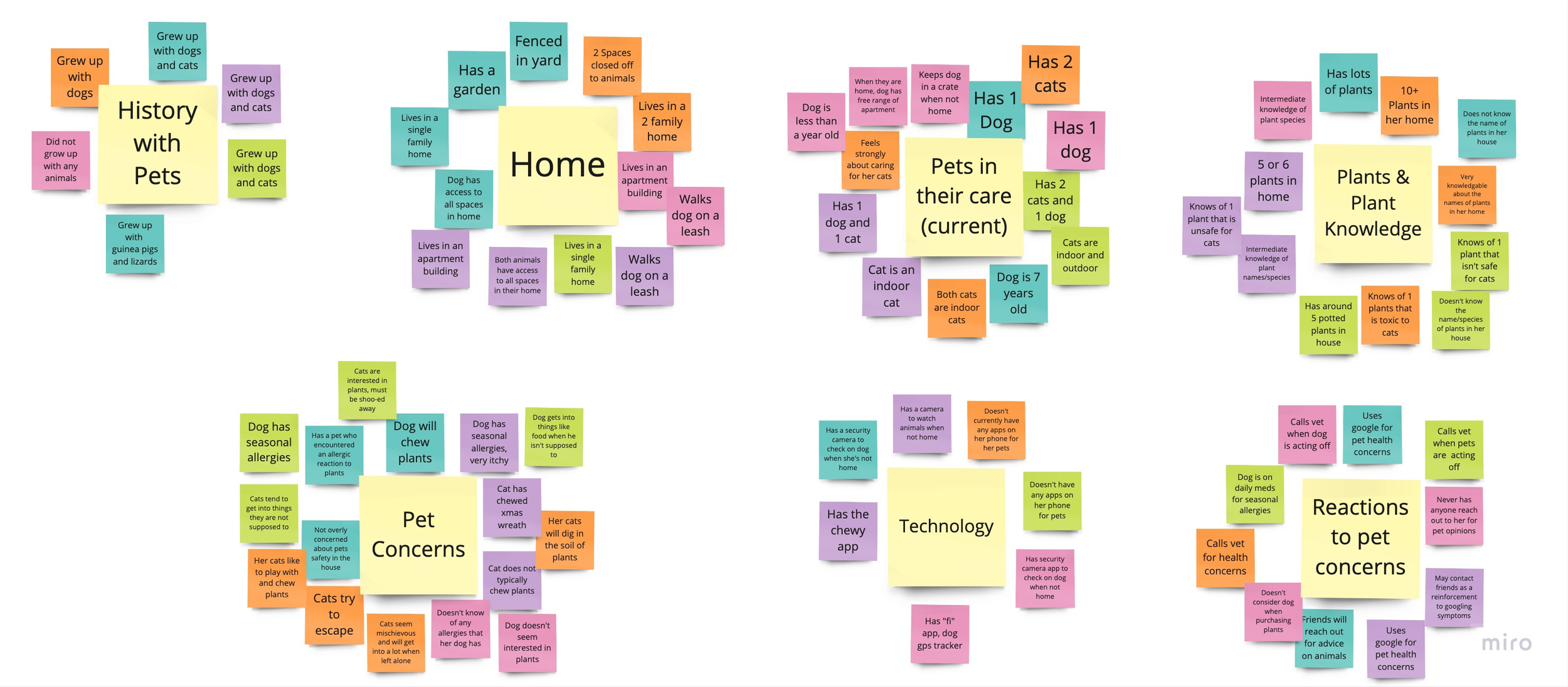
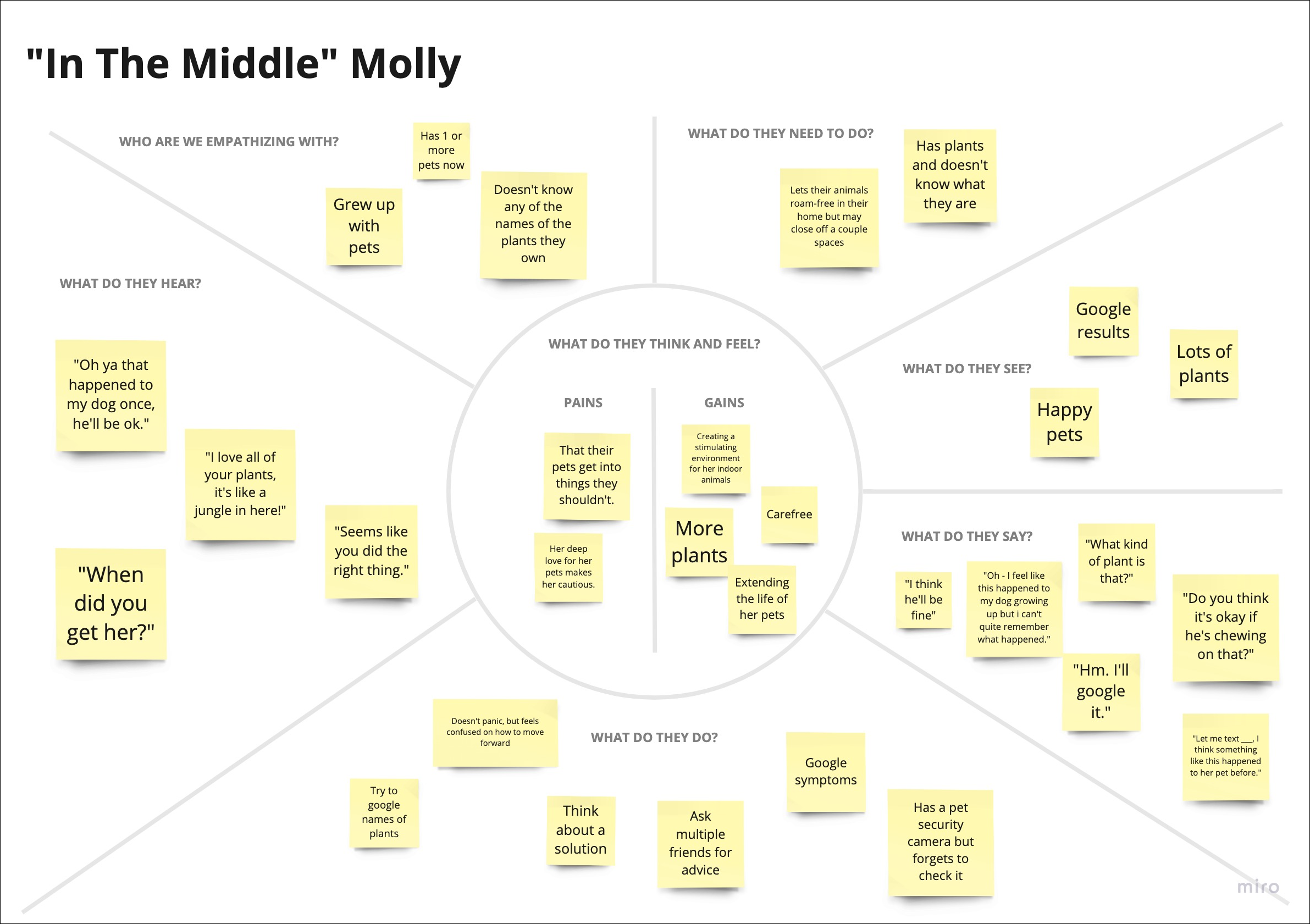
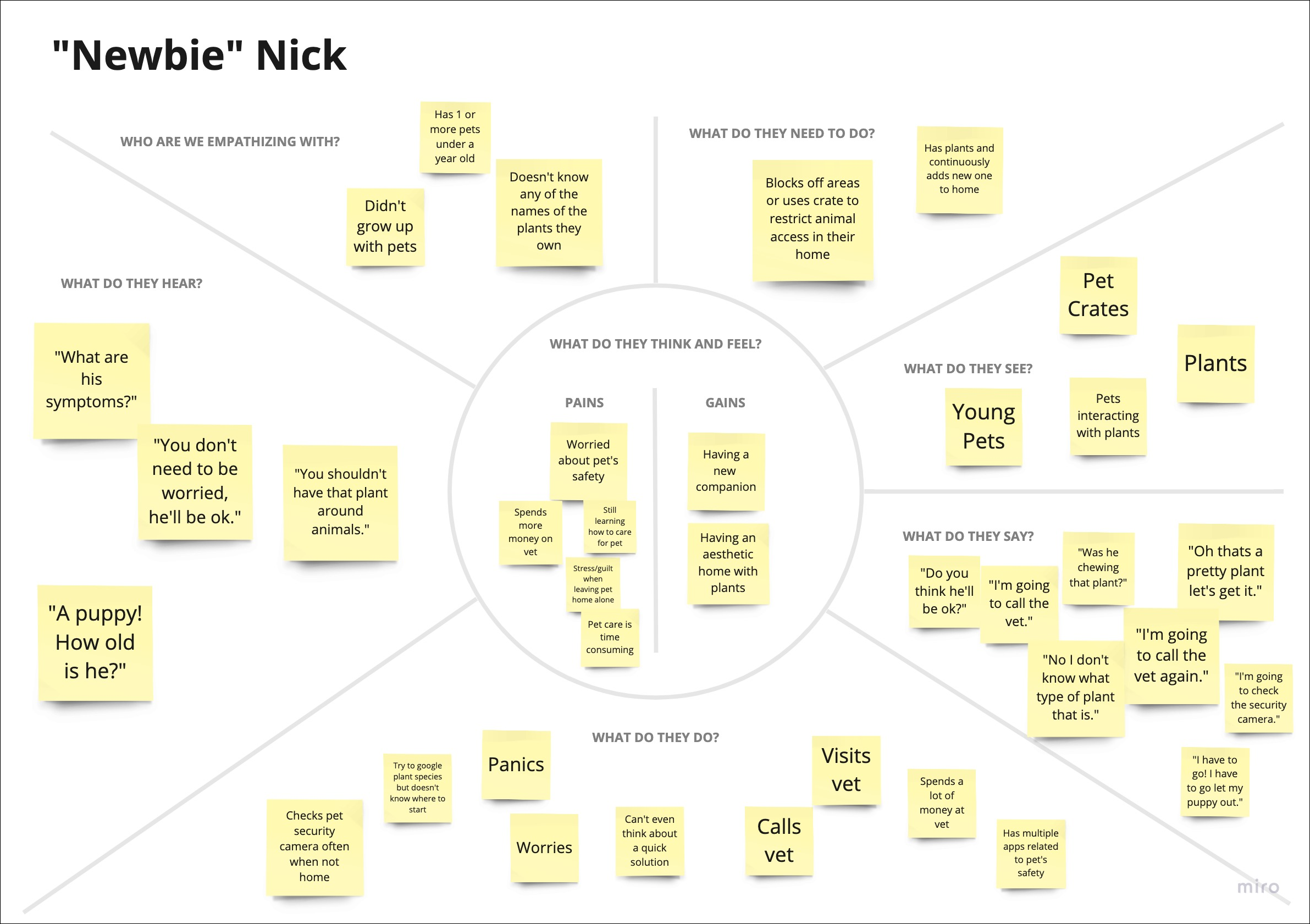
Empathy Maps
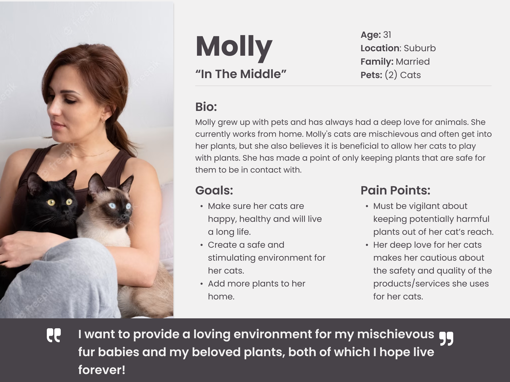
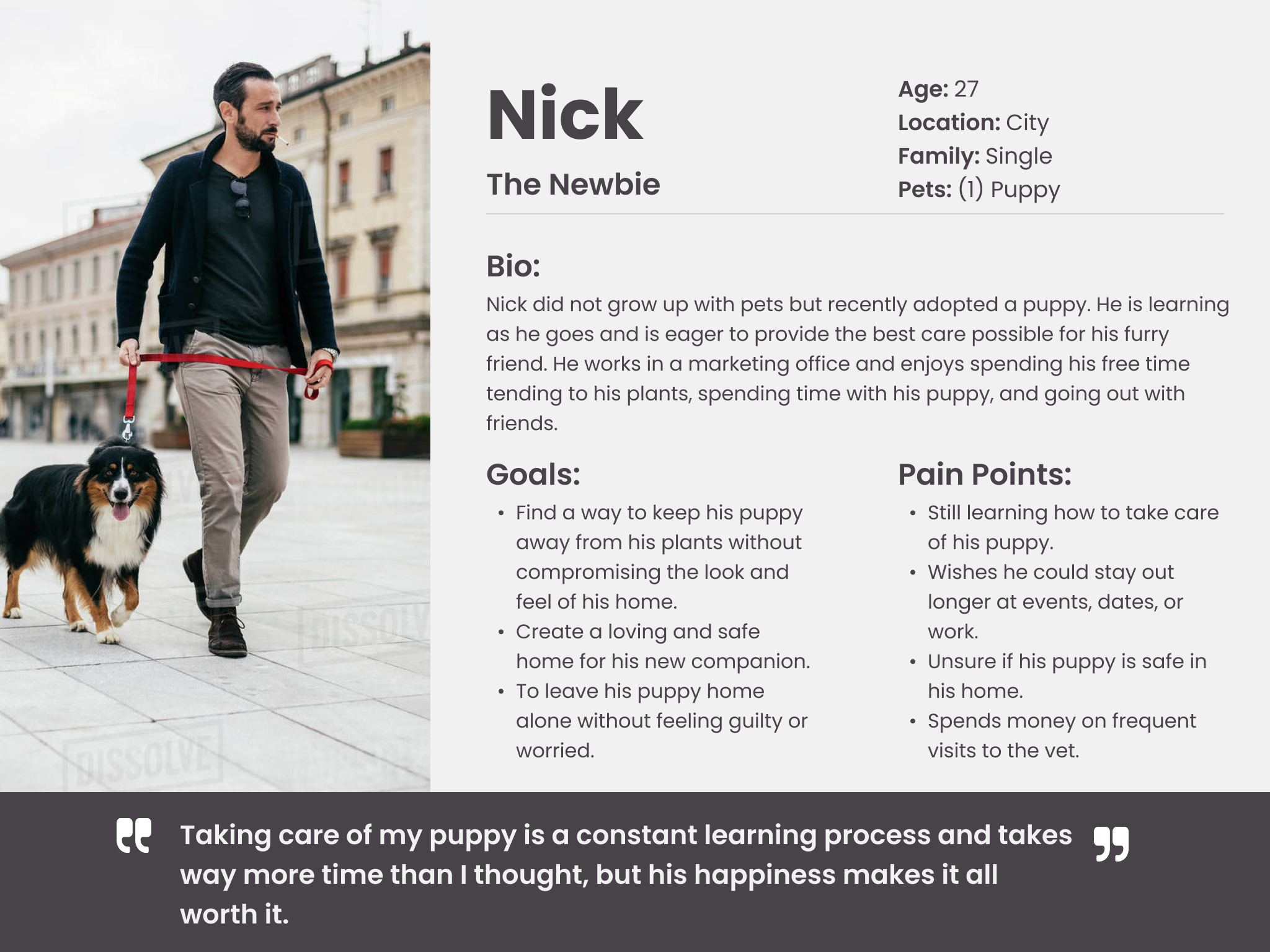
After putting together the affinity map, I identified 3 categories that each of my interviewees fit into. So, I created 3 empathy maps to better understand the user's perspective, emotions, and personality. This gave me a better grasp of their needs and wants, which was really helpful when it came to designing an app that would truly speak to them.
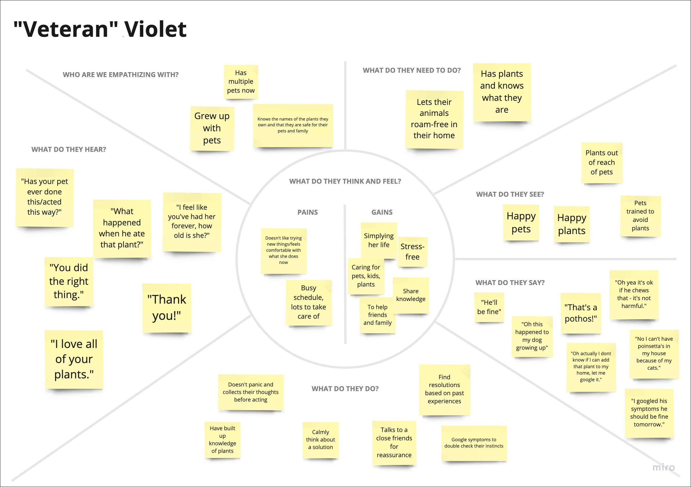
2. Pet owners worry about leaving their pets home alone, even more so if they have plants that could be harmful.
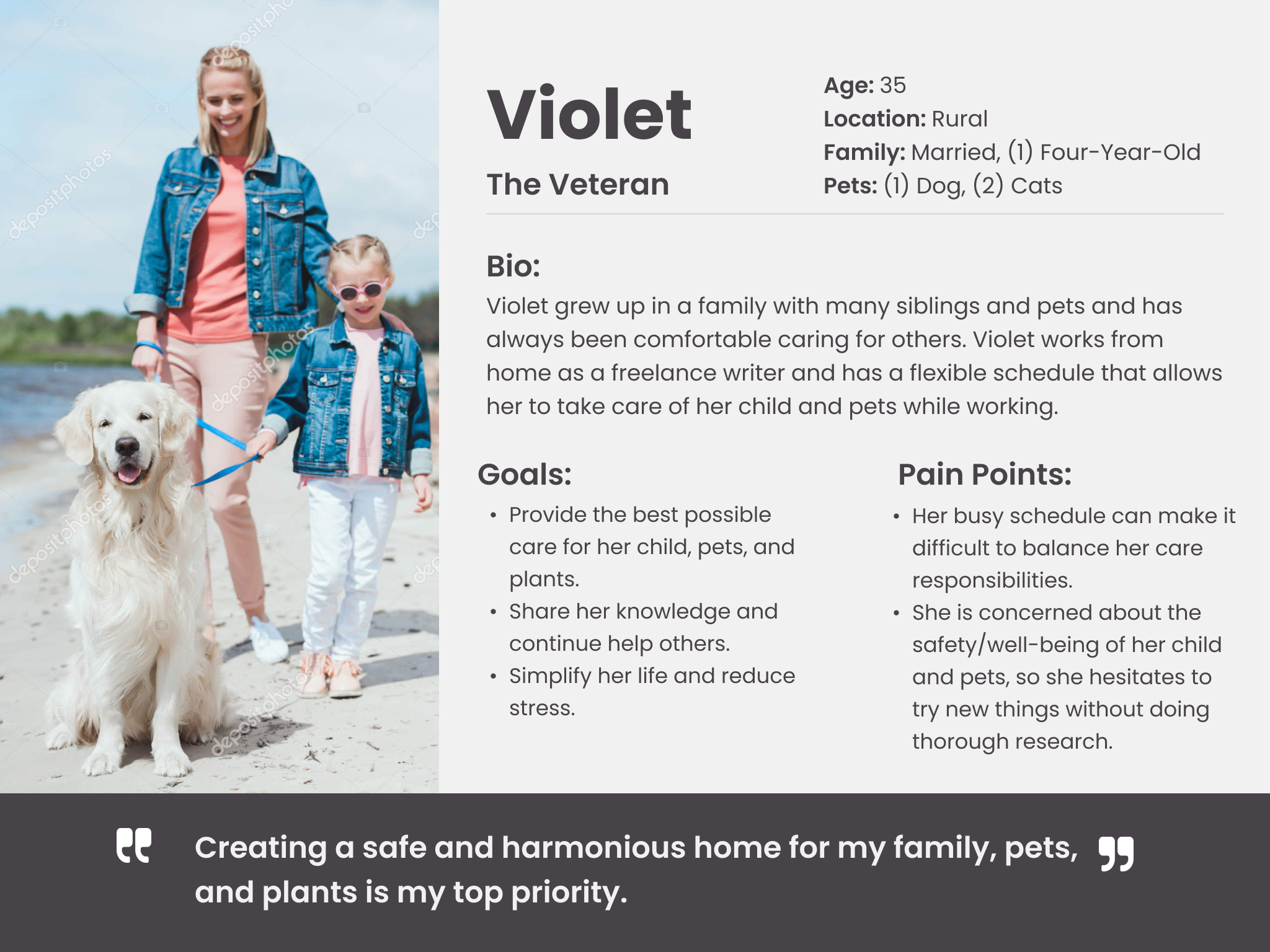
Personas
I created personas from the empathy maps to get a better understanding of the users who were going to use the app I was designing. These personas helped me really get into the heads of our target users, and understand their goals, needs, behaviors, and pain points. Armed with all that juicy info, I could make informed design decisions and prioritize features that would make their lives easier. All of this led to a design that's way more user-centered and effective.
Ideation
Brainstorm & Ideation
Brainstorming and idea-generating was the next step. I went through some 'How Might We" statements first, then got started on trying to figure out how to solve the problems I identified. One of my favorite aspects of brainstorming is the freedom to generate a multitude of ideas, no matter how unconventional or unusual they may initially appear. A bunch of the sketches I came up with in this stage ended up becoming actual pages in the final design.
User Stories
Continuing on- I came up with some user stories to really get into the heads of our pet owners and consider what they would want from my app. By empathizing with their perspective, I was given the ability to design in a way that effectively solves their problems.
Top 5 user stories:
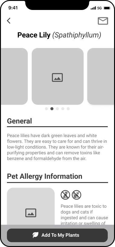
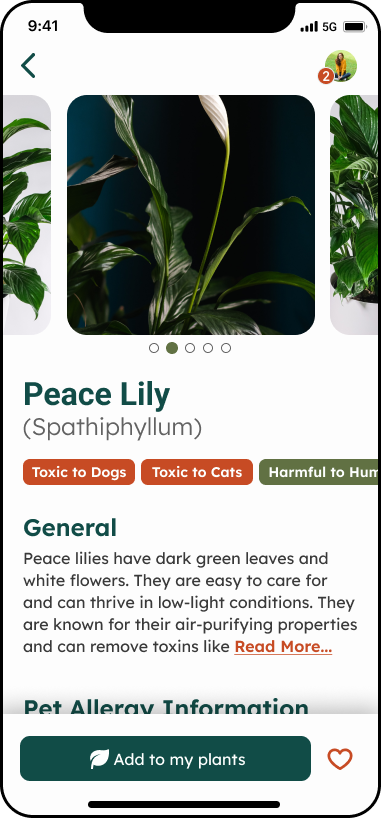
As a pet owner, I want to know what plants my pets are allergic to, so I know to keep them out of reach
As a pet owner, I want to know what plants are toxic to my pets, so I know to exclude them from my household.
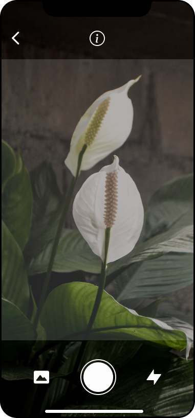
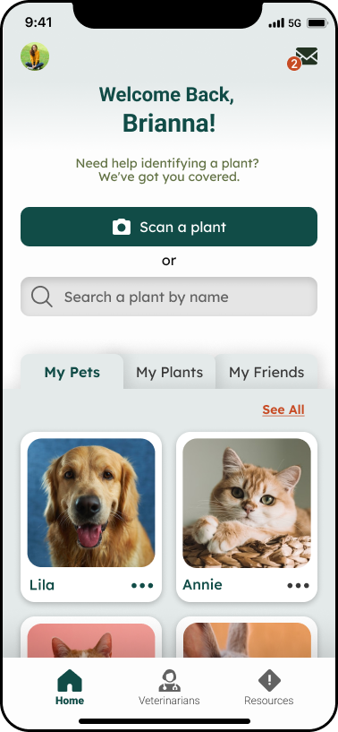
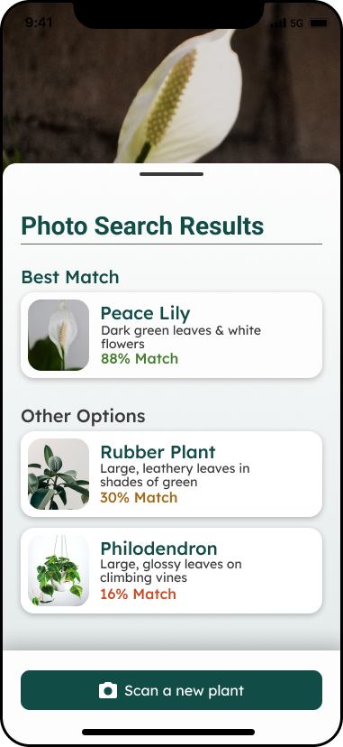
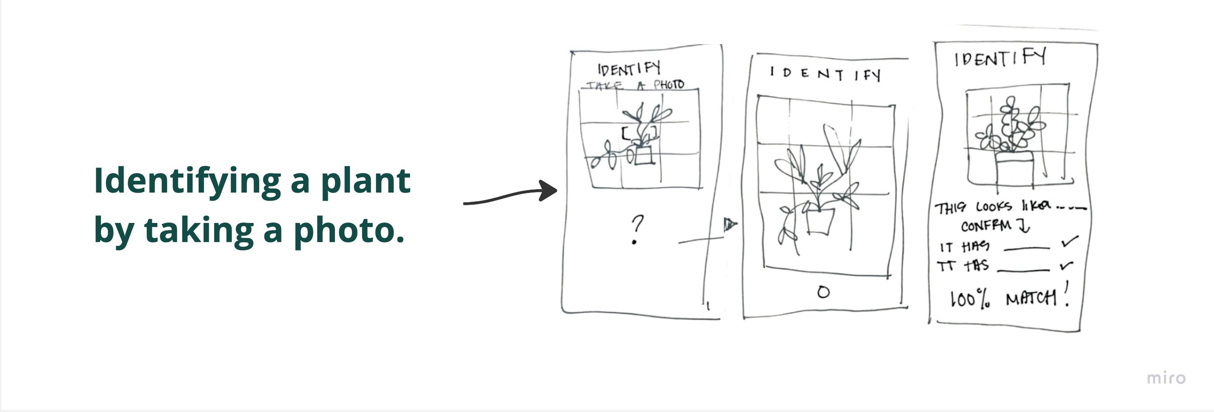
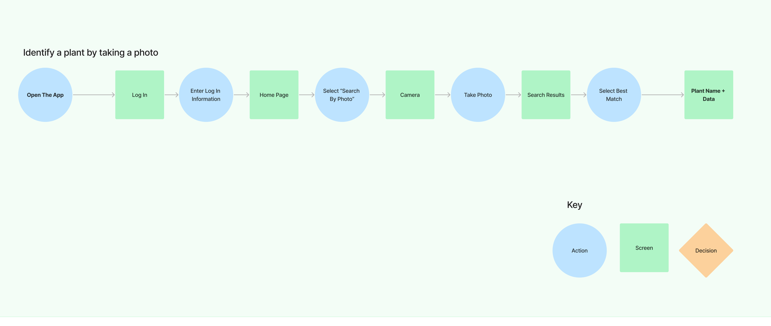
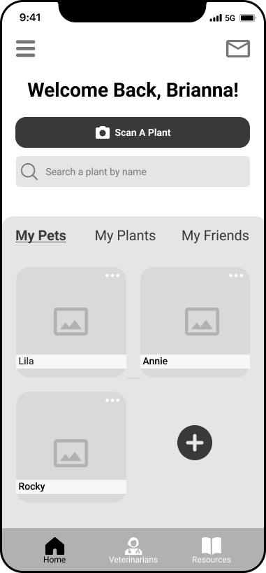
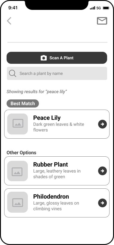
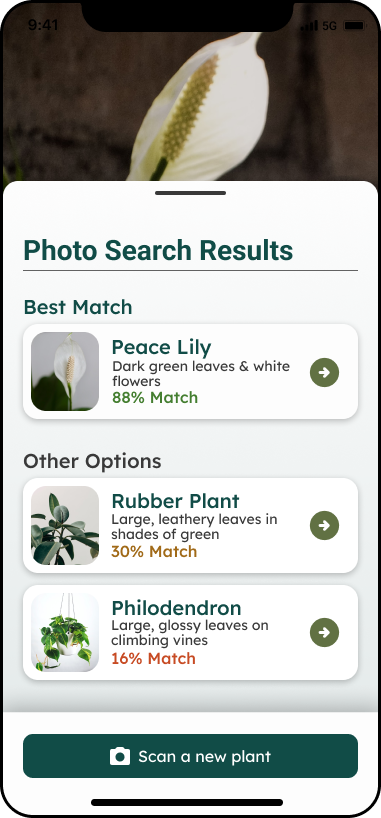
As a pet owner and user, I want to be able to take a photo to identify plants, so that when I don’t know the name of a plant I can get the information I want easily.
As a pet owner and user, I want to be able to search for plants I already know the name of, so that I can access the information I want easily.
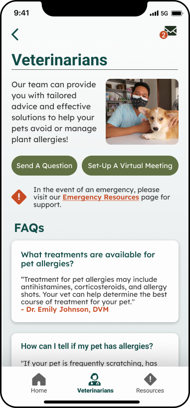
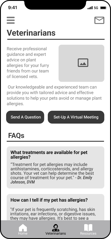
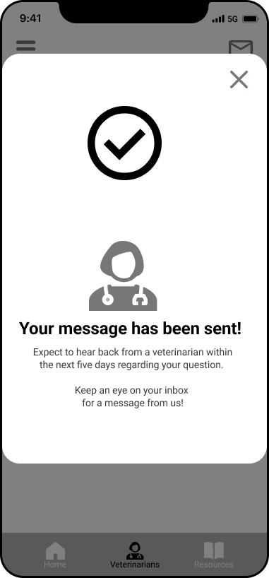
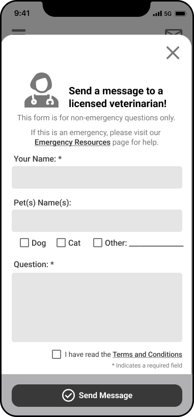
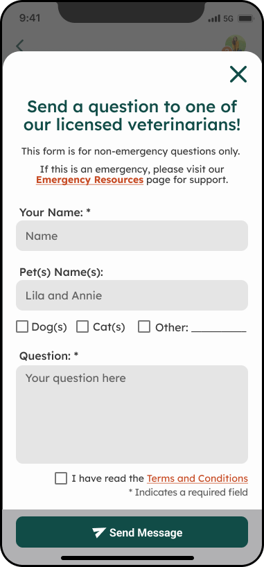
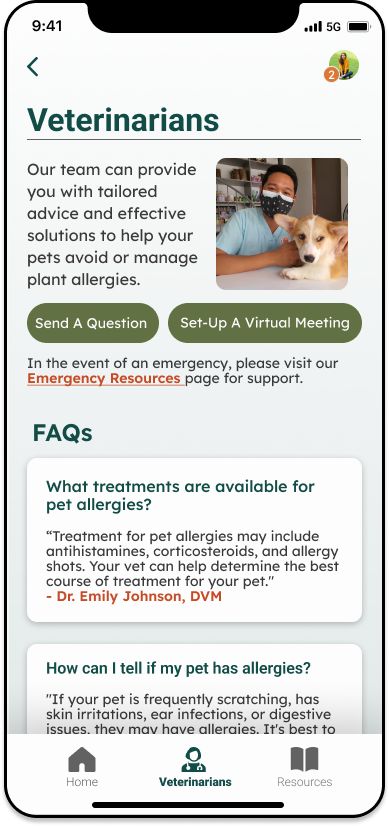
As a pet owner, I want to be able to connect with veterinarians, so I can feel confident when adding plants to my home.
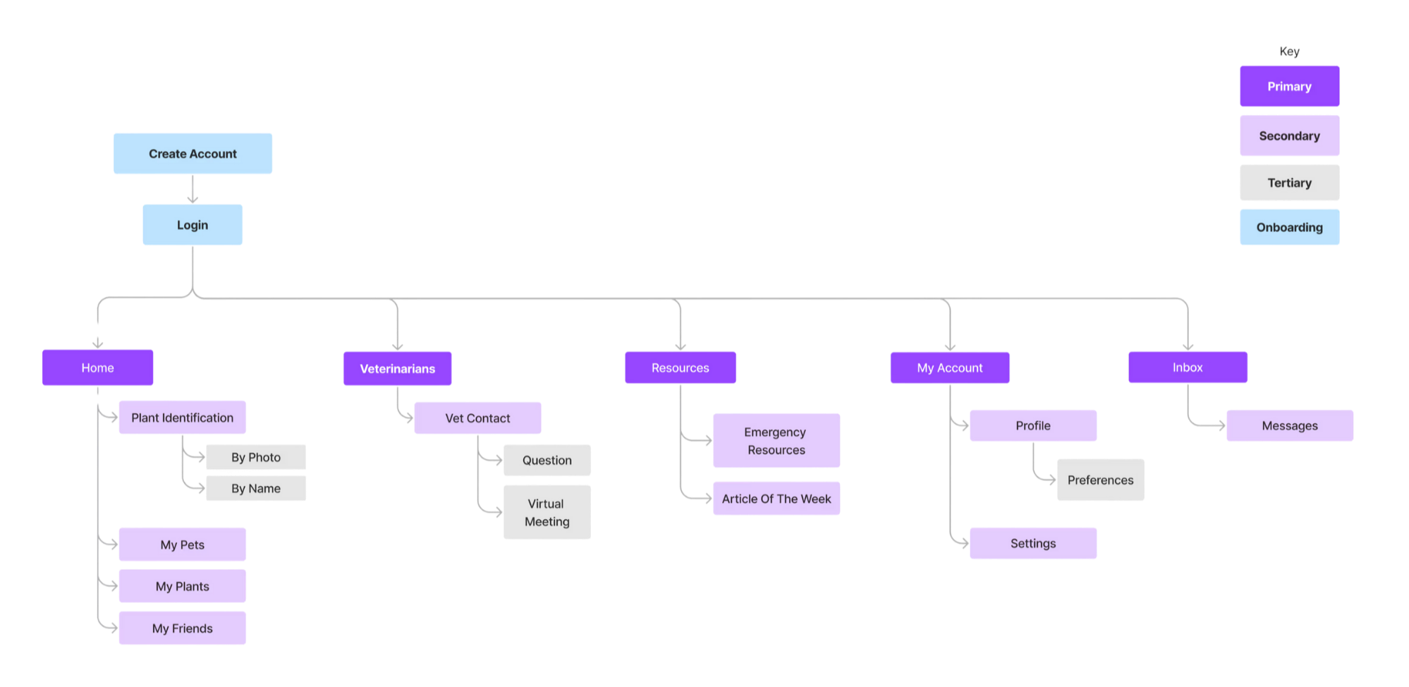
Site Map
Next - I made a list of the features and content that would be in each of the five main parts of the app - home, veterinarians, resources, my account, and inbox. This helped me wrap my head around how everything should be organized and structured in Sniff&Sprout. Plus, it helped me spot any parts that were redundant or confusing, so I could fine-tune the structure and flow before designing.
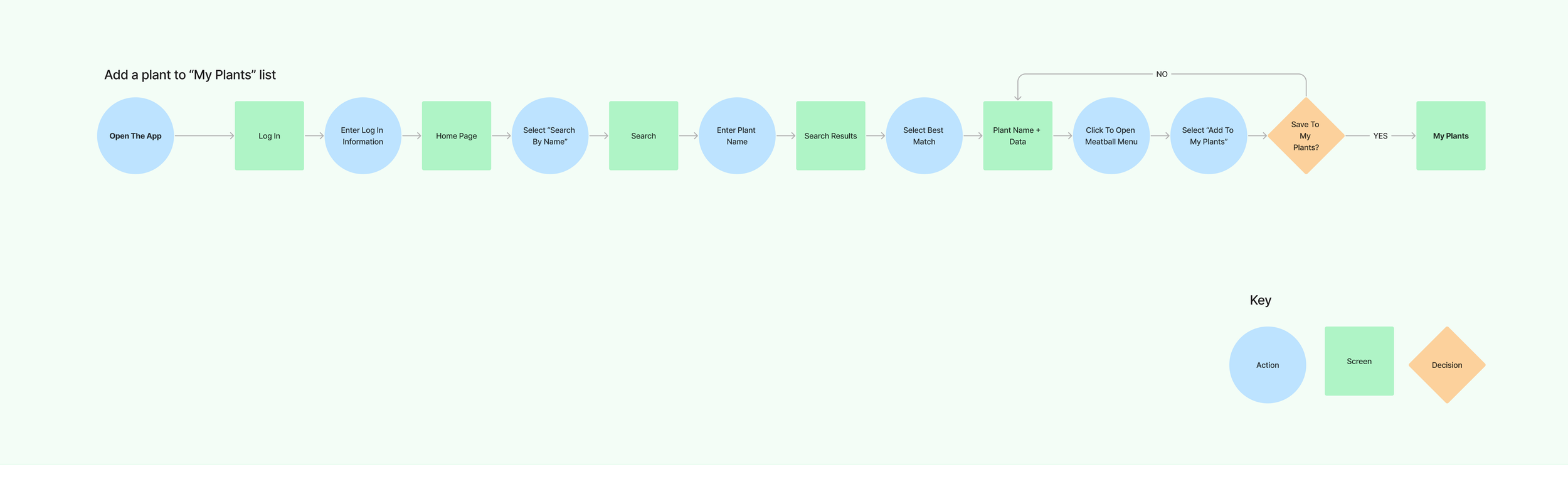
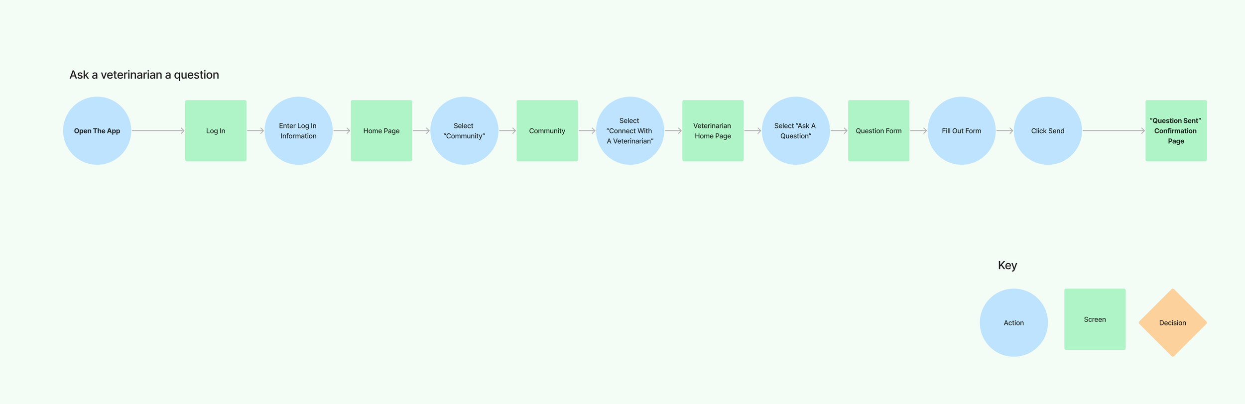
User Flows
I put together some user flows to map out three different ways someone might use Sniff&Sprout. By doing this, I could see where any problems might pop up and fix them before the app was even built. These flows also helped me figure out which parts of the app should really stand out visually, so people could use it without any trouble.
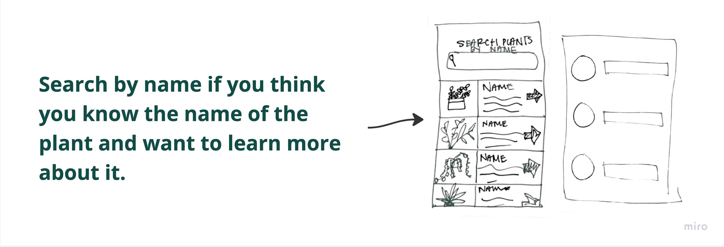
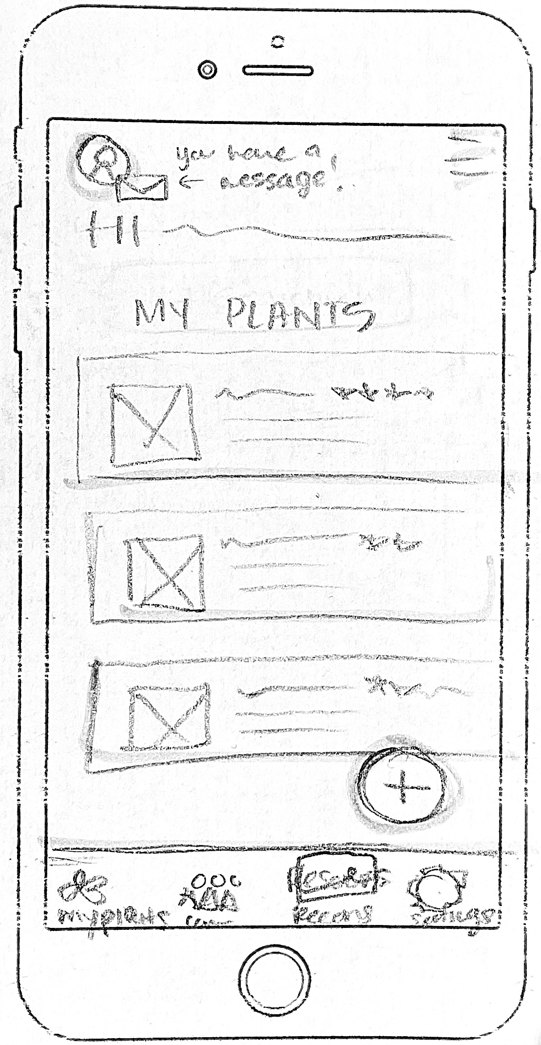
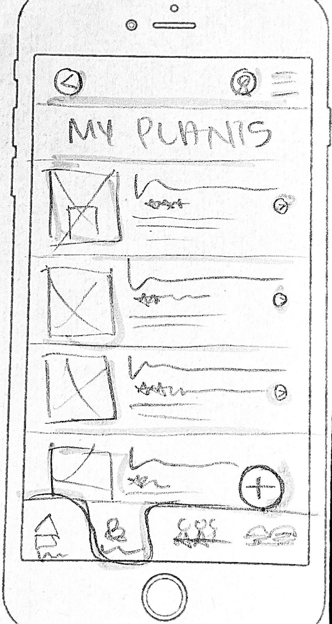
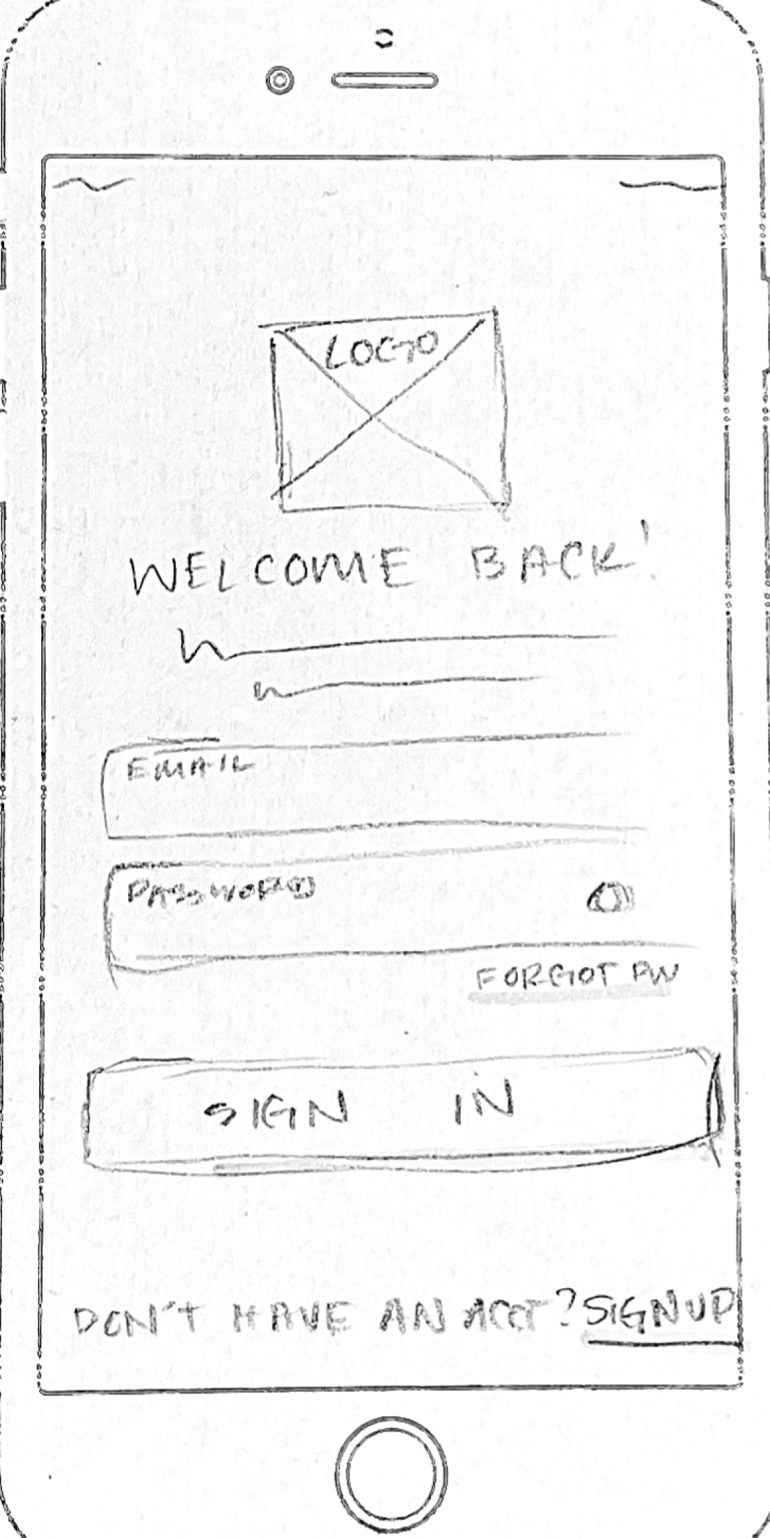
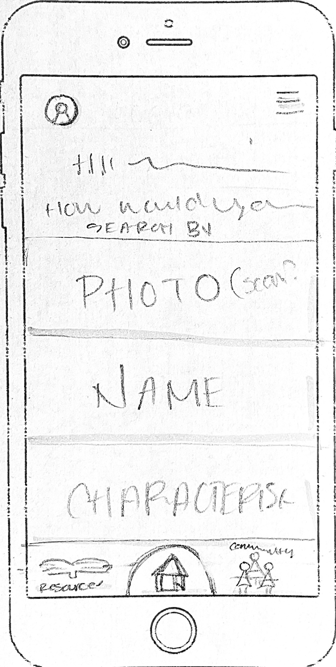
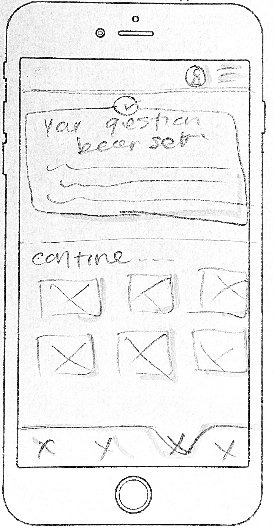
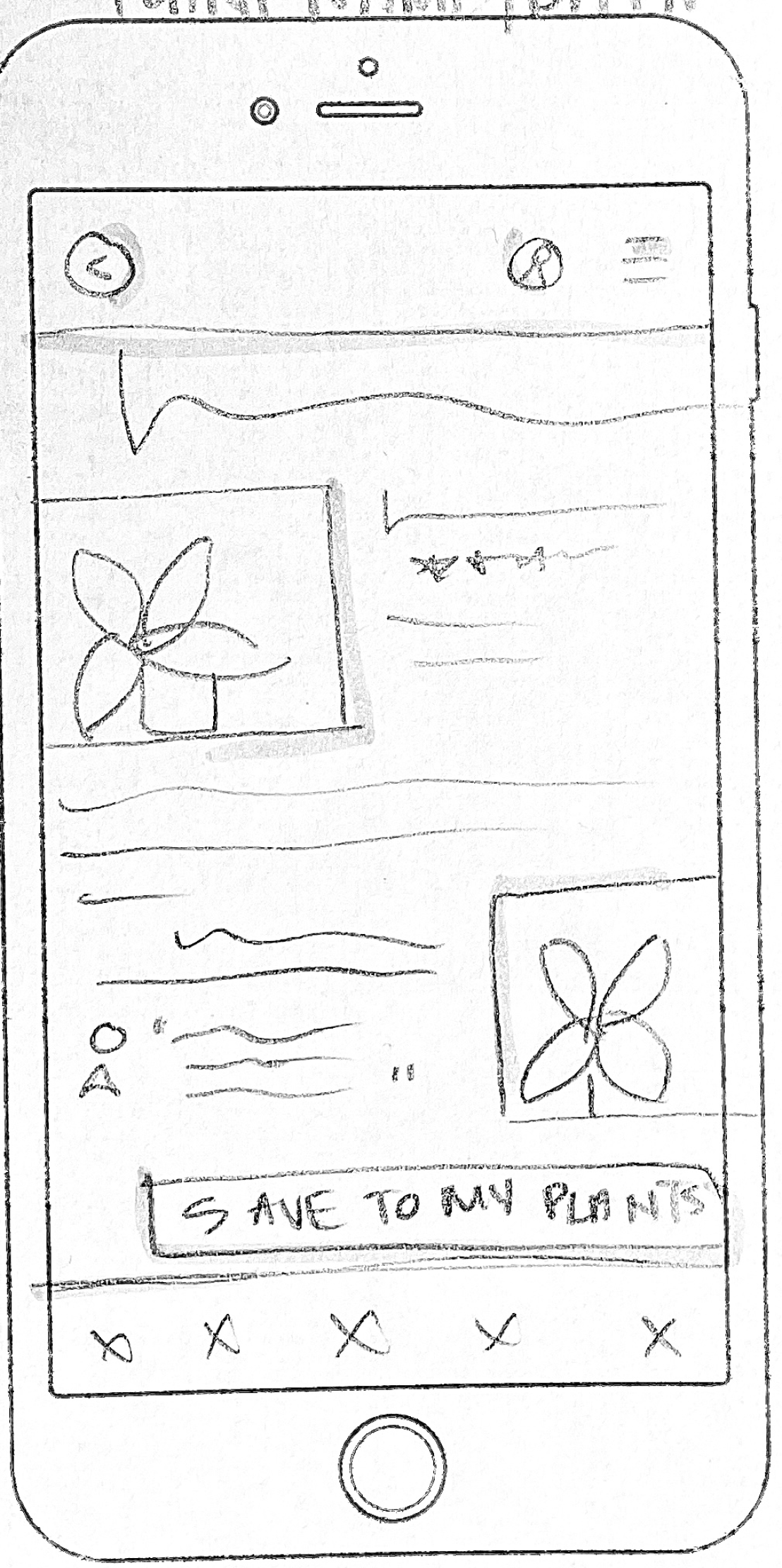
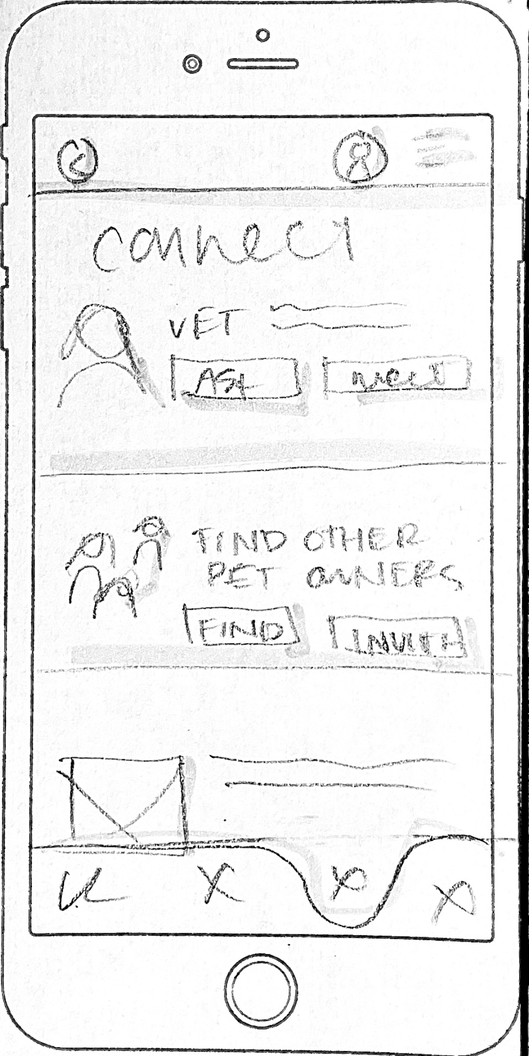
Sketches
Using all the everything I had gathered so far, I sketched ideas to tackle design challenges and explore different options. Some ideas were new, but a lot of them built off of early brainstorming. I was able to advance my basic sketches after refocusing on my users and their needs. These sketches provided a starting point for wireframes and prototypes.
Design
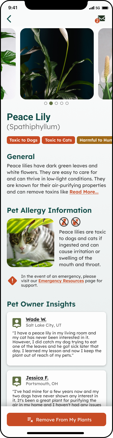
Wireframes
My wireframes are a more detailed/curated version of the sketches, showing the layout and functionality of each screen in the app. This stage allowed me to refine and further develop my ideas beyond the initial brainstorming session. While sketching is a very useful tool for generating ideas, creating wireframes were the beginning of bringing my ideas to life.
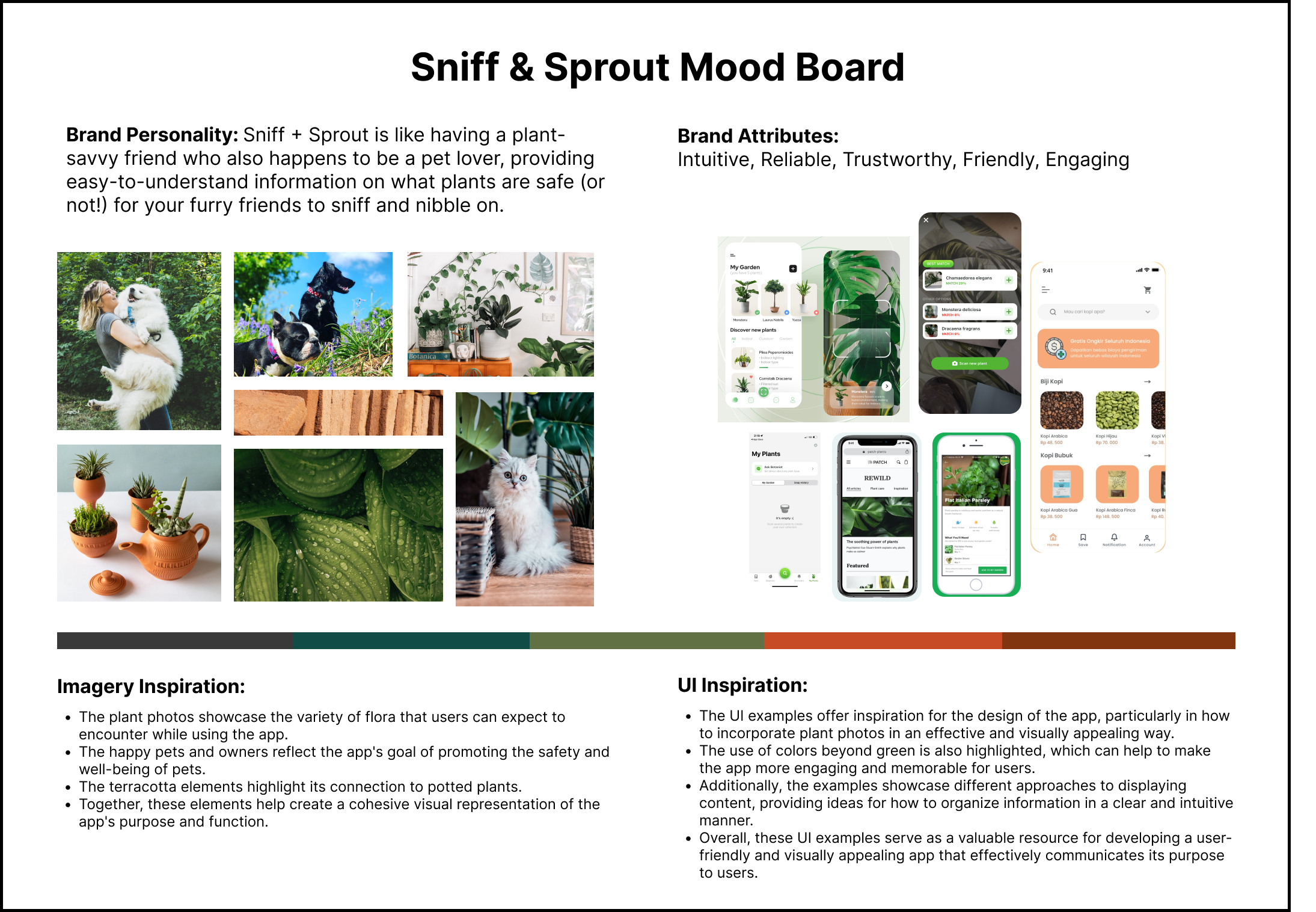
Mood Board
Next - I put together a mood board to help define the brand personality, giving Sniff&Sprout a solid visual and conceptual foundation. It made things easier as I began adding color and design features to my wireframes.
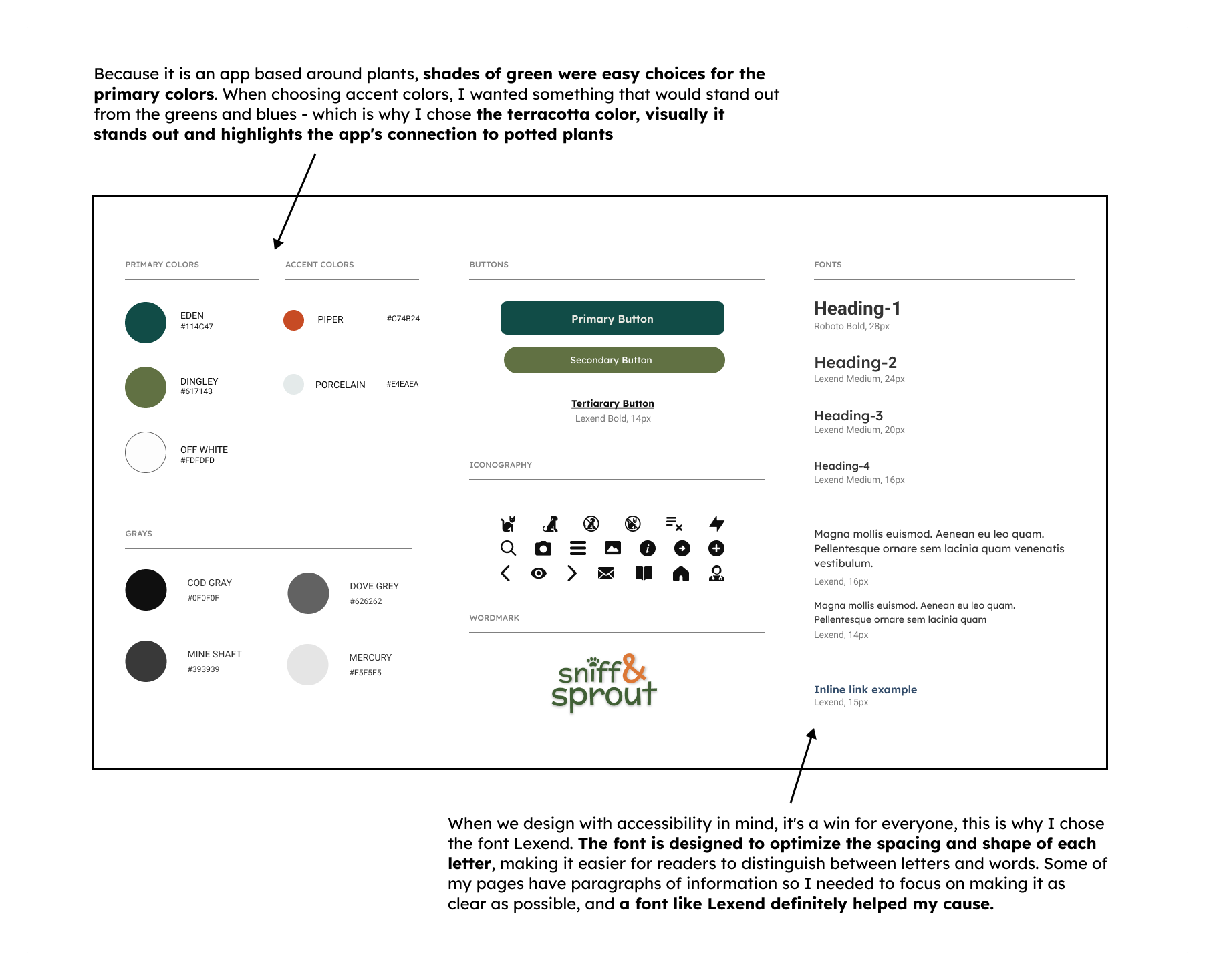
Style Guide
From the mood board I created a style guide. I wanted to make sure Sniff&Sprout’s brand looked polished and cohesive. First - I created a wordmark and then selected colors, fonts and icons that matched Sniff&Sprout’s vibe.
Choosing colors wasn't just about looks - I also considered accessibility and contrast, so my design system would be easy on the eyes and easy to implement.
High Fidelity UI's
(before user testing)
When I was working on high-fidelity screens, my main focus was making sure the app was super easy to use and understand. I wanted to make sure all the elements were clear and helpful to the user.
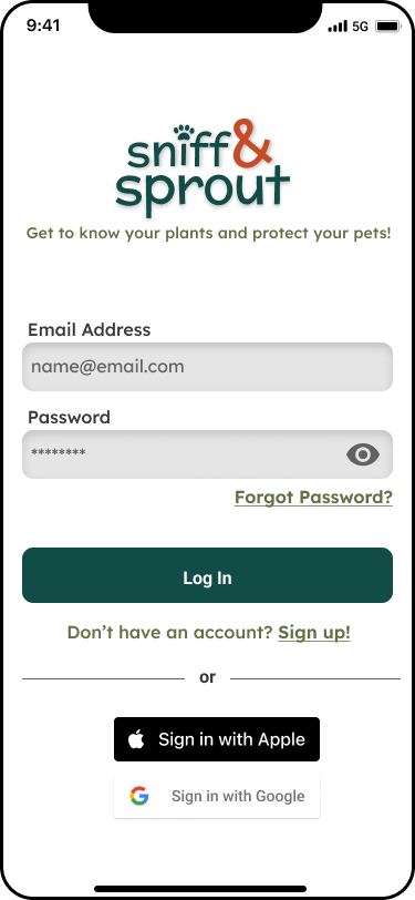


Prototype
(before user testing)
I built the app pages I had designed into a prototype. My main focus was keeping things simple and easy to use, so pet owners could get the info they needed ASAP.
Test
Usability Testing
To make sure my app was the best it could be for pet owners, I did usability testing over Zoom calls. I got pet owners to try out the Sniff&Sprout prototype. I wanted to see if the app was user-friendly and if it met the needs of pet owners, so I asked for feedback and watched them use the app.
My main goal was to see how users interacted with the app and find any pain points or issues. I tested three different flows:
Take a photo to identify a plant
Search for a plant by name and add it to their "My Plants" list
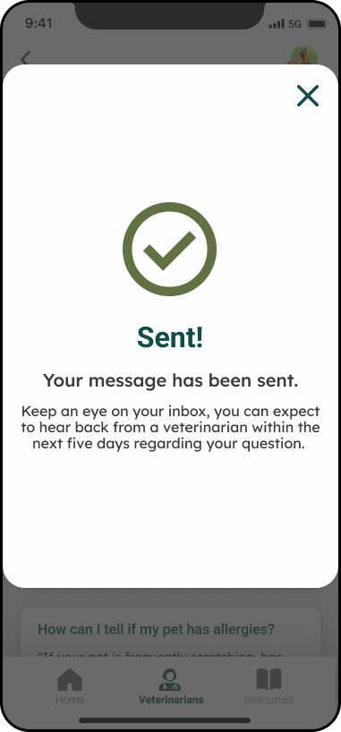
Ask a vet a question for extra help
Redesign
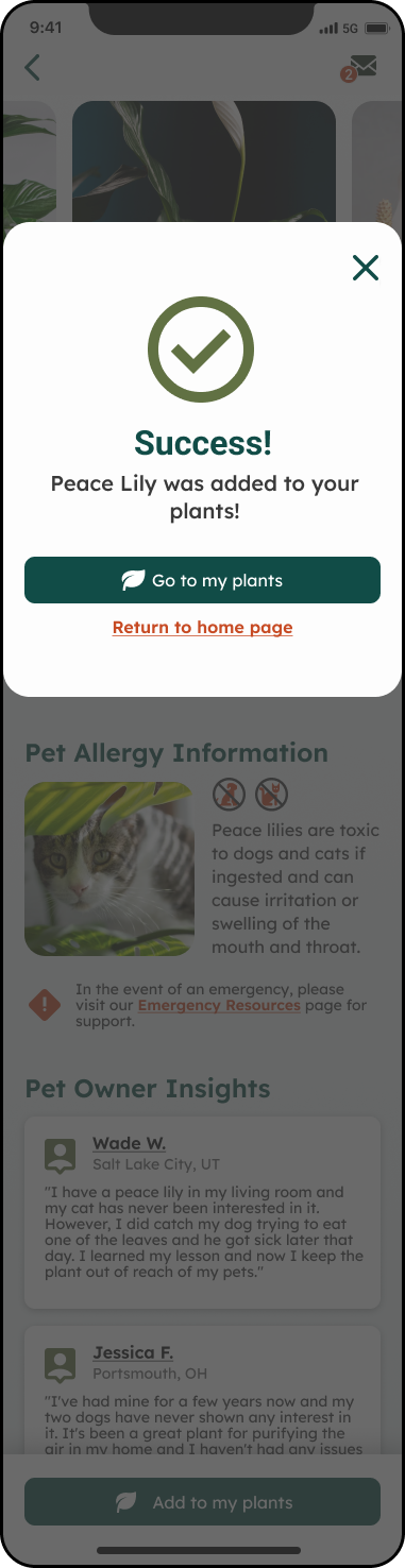
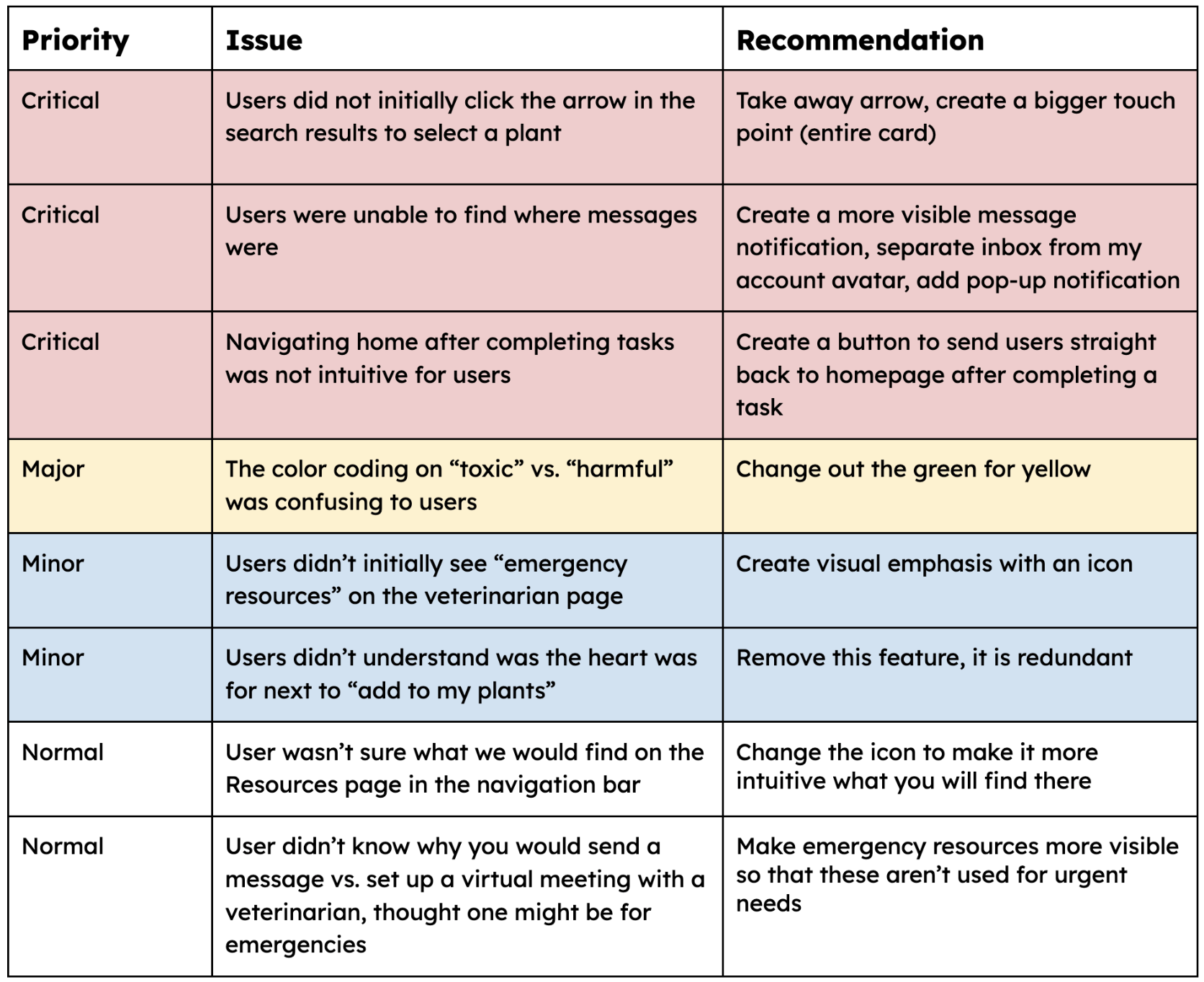
Critical Issue 1
Users did not click the arrow on the search result card.
Summary:
• Users were asked to identify a plant/search for a plant and were brought to a results page where search results were presented in cards:
• All 5 users clicked the middle of the card initially
• When they realized that didn’t work, they did click the arrow
• This page was part of two different user flows, and even in the second user flow all 5 of them clicked the middle of the card before clicking the arrow even though they had already gone through this process once.
Recommendation:
Create a bigger touchpoint (the entire card) and take away the arrow.
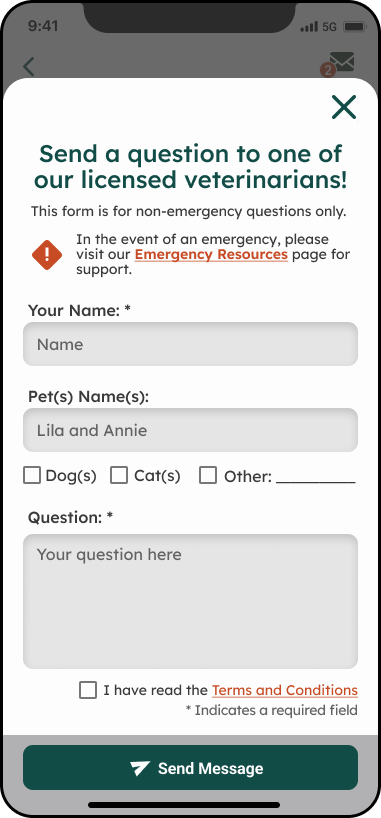
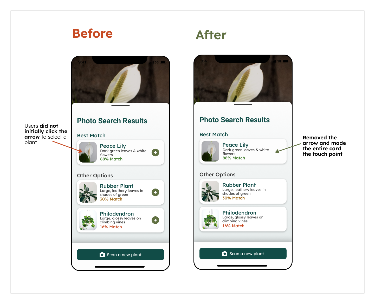
Critical Issue 2
Users were unable to find where messages were.
Summary:
• After sending a message, users were asked where they would expect to find a message that was sent back to them
• 4 users never found where messages were
• 4 users didn’t recognize the top right logo as an avatar
• After explaining to them the location, users noted that they assumed the little “2” notification would be something like “a friend added you!” or a problem with their billing, etc.
Recommendation:
Separate inbox from my account and put both icons at the top bar, add a pop-up message to notify users of new messages.
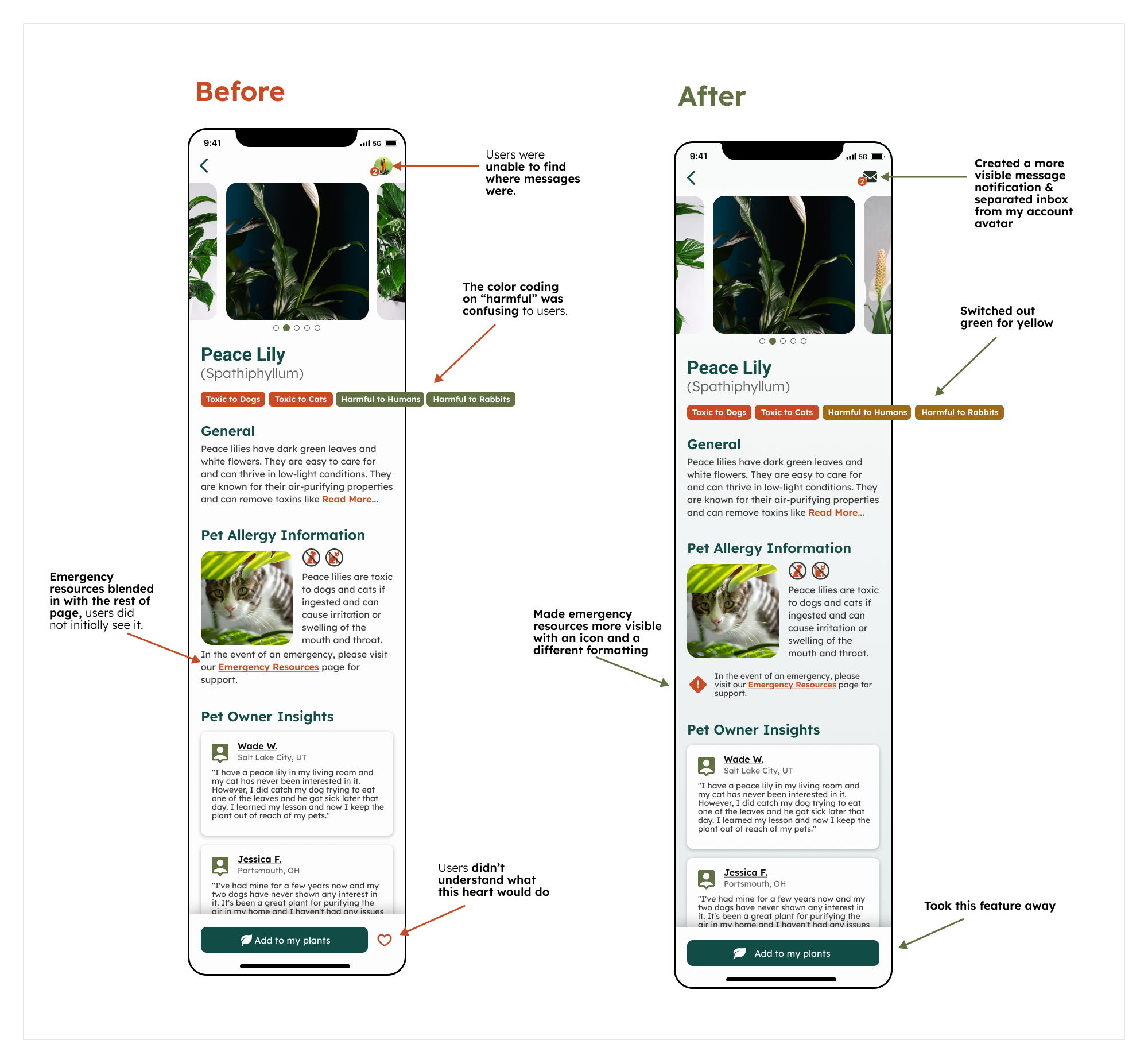
Critical Issue 3
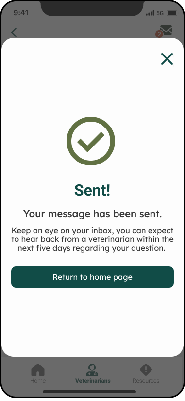
Navigating home after completing a task was not intuitive to users.
Summary:
• After completing each task, users were asked to return home
• 2 users mentioned right away that they didn’t know how to get back home
• 3 users clicked back twice and mentioned that it was odd there wasn’t anything that sent them straight back home after completing a task
• All users looked around for a home button before clicking the back button a bunch of times
Recommendations:
Create buttons to send users straight back to the homepage after completing a task.
Prototype
(after user testing)
With all the data I got on how users interacted with my design, I reworked my prototype to make sure the features fit and felt intuitive.
Reflect
Overview
Designing Sniff & Sprout was an invaluable opportunity to showcase and enhance my UX/UI skills. While initially drawn to the aesthetics of the project, I found the true challenge—and reward—was in balancing visual appeal with functional usability.
The project began with conceptualizing the app’s layout and flow, crafting a seamless, intuitive journey for users. Usability testing proved essential, and in hindsight, additional early-stage research could have enriched the design further. Given more time, I’d have explored advanced features to elevate user engagement and add more value for pet owners.
Though Sniff & Sprout may not progress beyond this prototype, I’m proud of its impact and the insights it offered. This experience reinforced my commitment to designing with clarity, simplicity, and user-centered innovation.