UX/UI Design

My team and I conducted heuristic research and provided design recommendations for Eqtble (a people analytics platform that transforms HR data into actionable insights). My work specifically focused on ease of use and clarity to support Eqtble's users.
Role:
UX Researcher +
UX/UI Designer
The Problem
EQTBLE's platform consisted of an undeveloped design system, inconsistencies, and unclear features, making it challenging for users to smoothly complete tasks.
Overview
Team:
1 Project Manager
1 Senior Designer
3 Designers
Duration:
5 Weeks
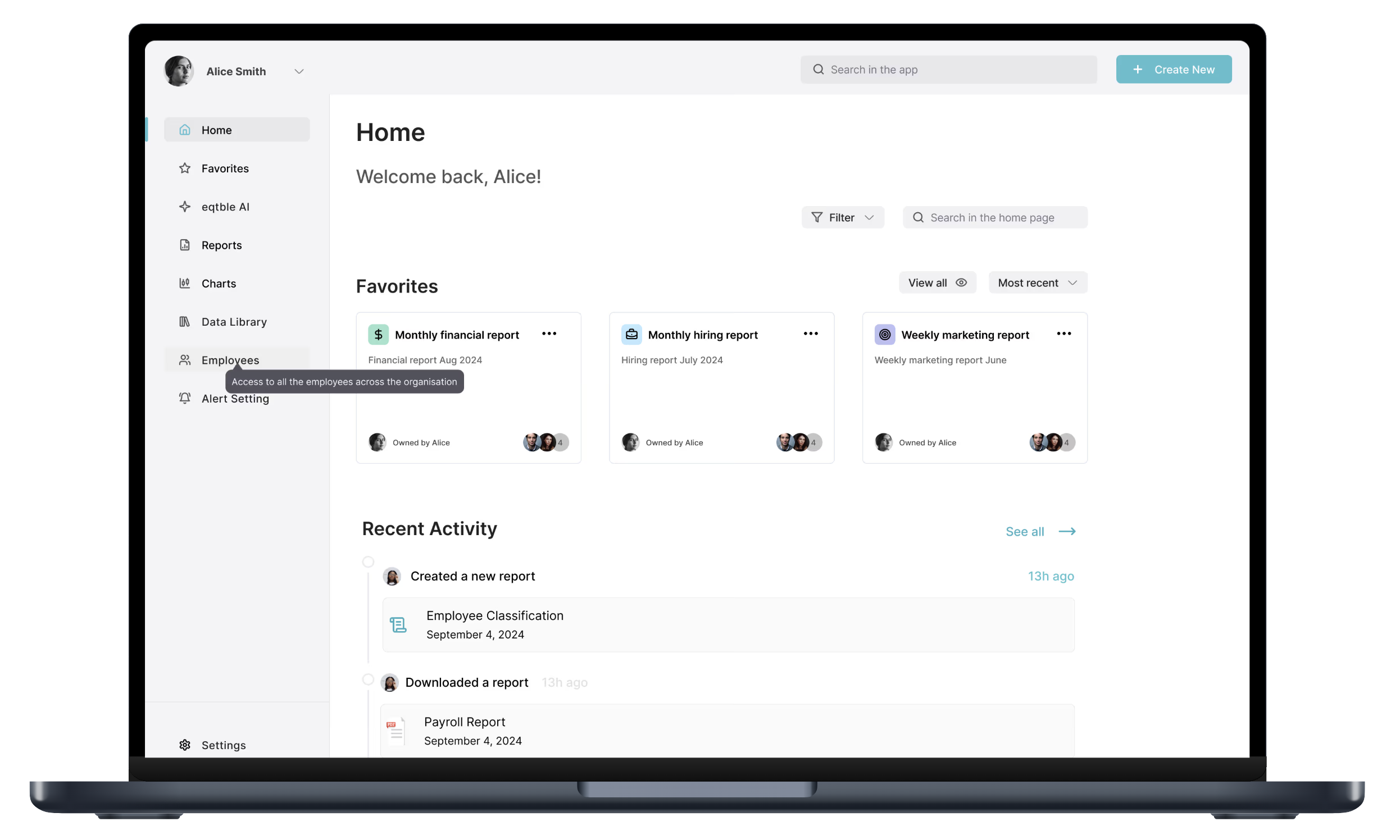
Our Solution
First we did an extensive heuristic evaluation and competitive analysis. From our findings - we created a design system for consistency, designed tooltips to support new users and features, and redesigned the landing pages to be more intuitive. From this, a new homepage was developed that helped users access essential features easily. We also enhanced the navigation with clearer labels and visual cues.
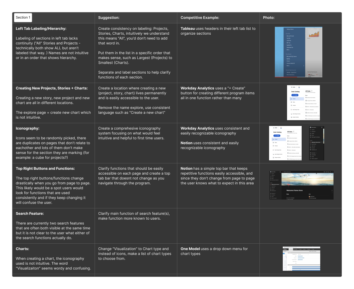
Competitive Analysis + Heuristic Evaluation
This table outlines the key findings from a comprehensive heuristic evaluation and competitive analysis I conducted for Eqtble. The evaluation aimed to identify usability strengths and areas for improvement, while the competitive analysis compared Eqtble’s features, user interface, and overall experience against industry competitors.
Brainstorm + Ideation
This section summarizes the process and outcomes from the brainstorming and ideation sessions conducted for Eqtble. These sessions were crucial in generating innovative ideas to improve user interaction, focusing on accessibility, data visualization, and overall user experience.
After we completed our Competitive Analysis and Heuristic Evaluations individually, we met as a team to discuss our findings and collectively identify the key areas we needed to address in the redesign. From this, we were able to determine our main priorities.
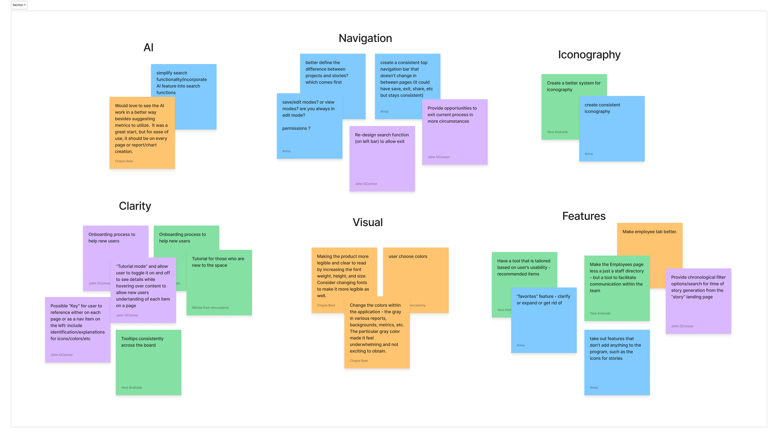
We started off with crazy 8's, where we all wrote down as many ideas as we could within the allotted time. I grouped them together here to get a better understanding of what we all saw.
Next Steps
Our project manager took our ideas and clarified which features we'd be focusing on. We were all assigned to assist in the homepage, and I was specifically assigned help documentation/tooltips.
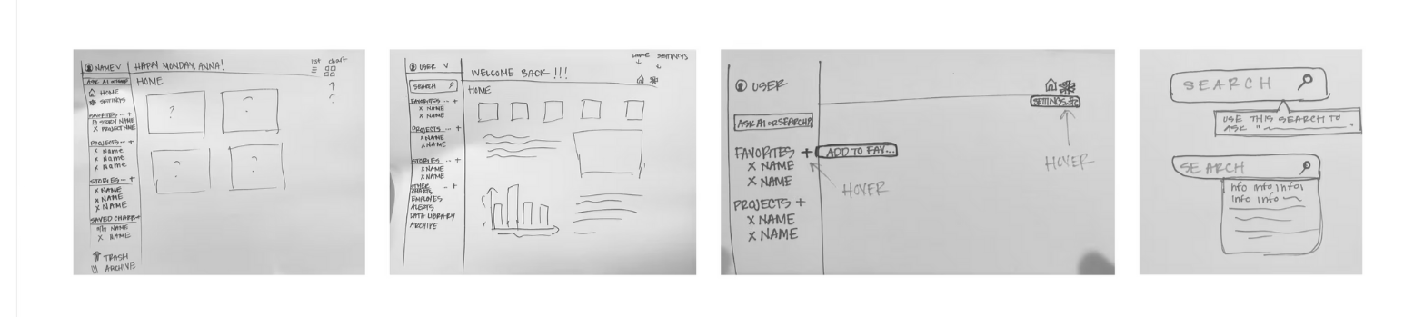
Sketches + Lofis
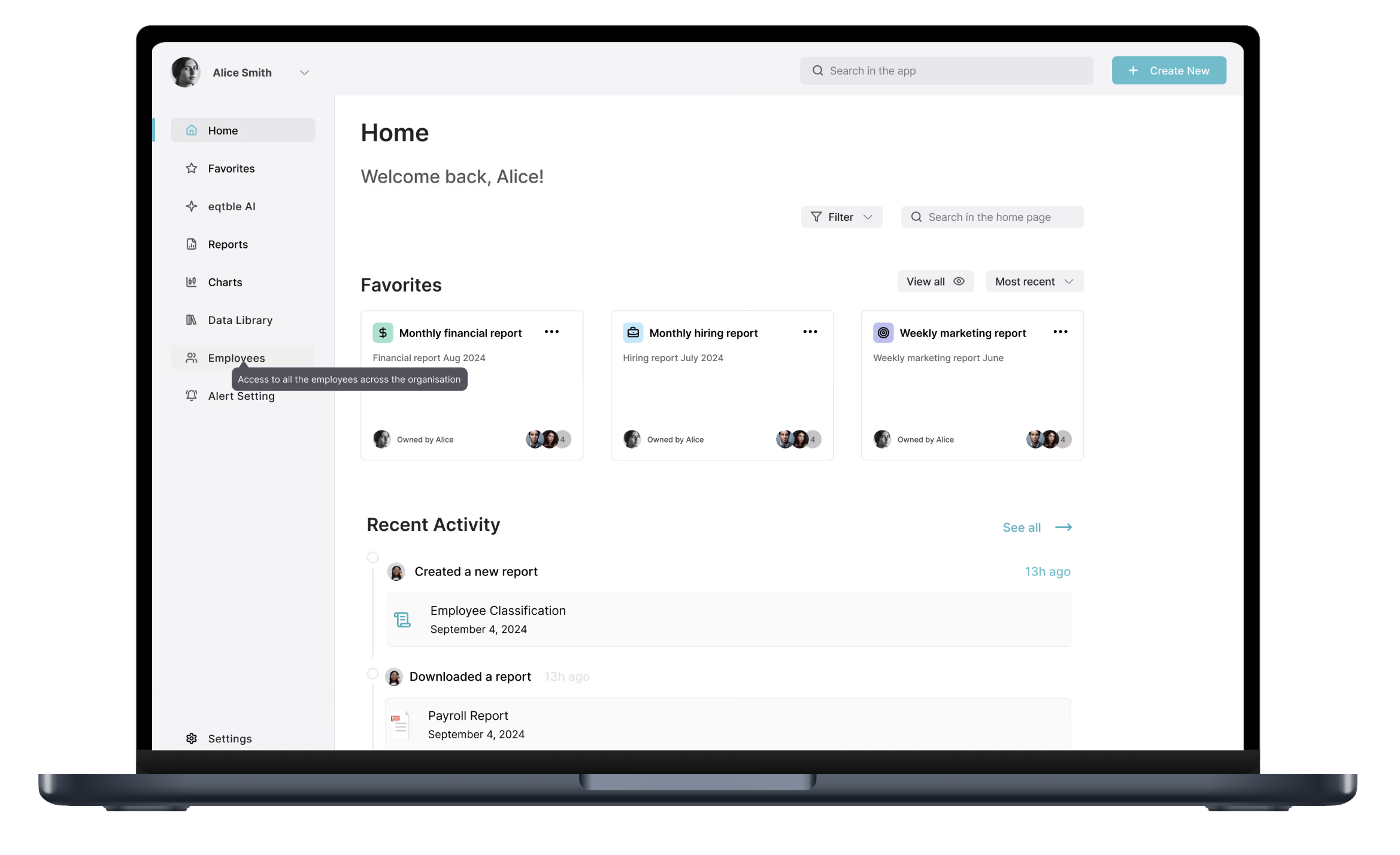
We each went through a couple of phases of sketches and lofis to refine our features and how they would interact with the existing program. While I was creating tooltips, I kept in mind clarity, ease of use, and contrast accessibility.
Design Recommendations
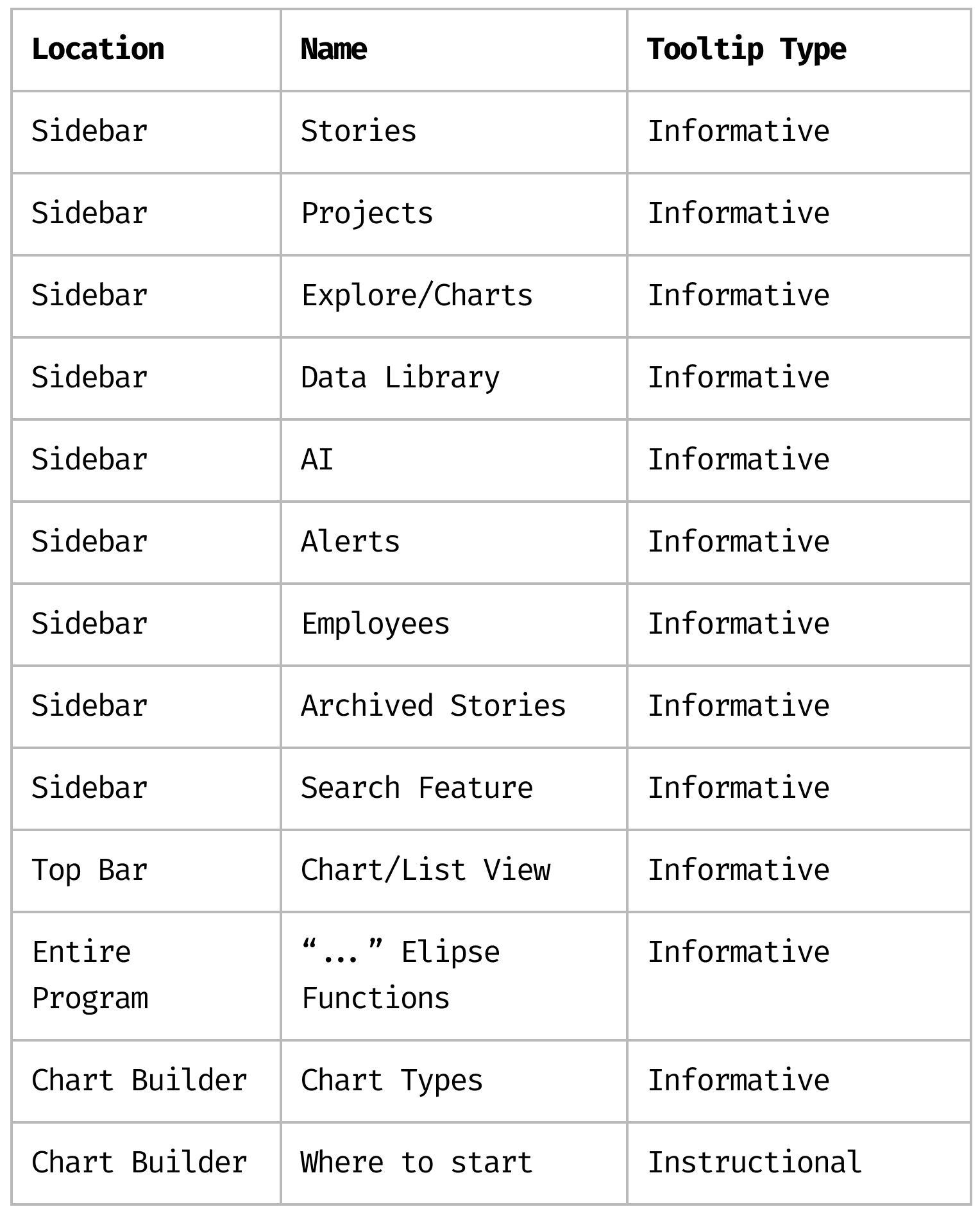
Tooltip Locations
After my contributions were given to my project manager for the homepage, I focused on the tooltips. I first researched types and made a table suggesting locations for EQTBLE to incorporate them.
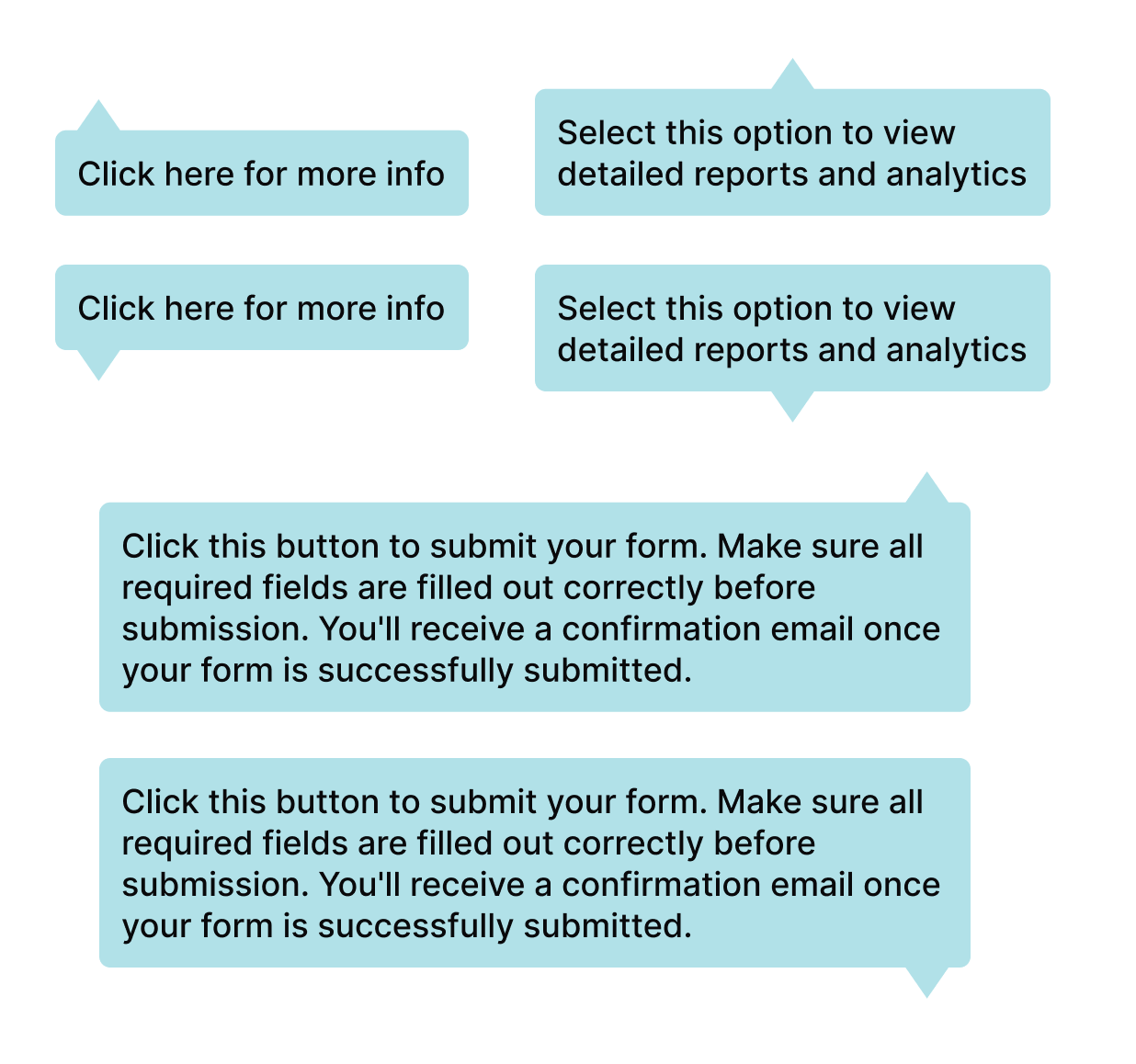
Tooltip Design Option 1
The tooltip designs are optimized for accessibility and usability, passing contrast standards and featuring medium-weight text for clear visibility. They are fully responsive, dynamically adjusting between small, medium, and large sizes based on the amount of text entered. Additionally, the tooltips include a boolean property that allows them to be positioned either above or below the feature for greater flexibility in different contexts.
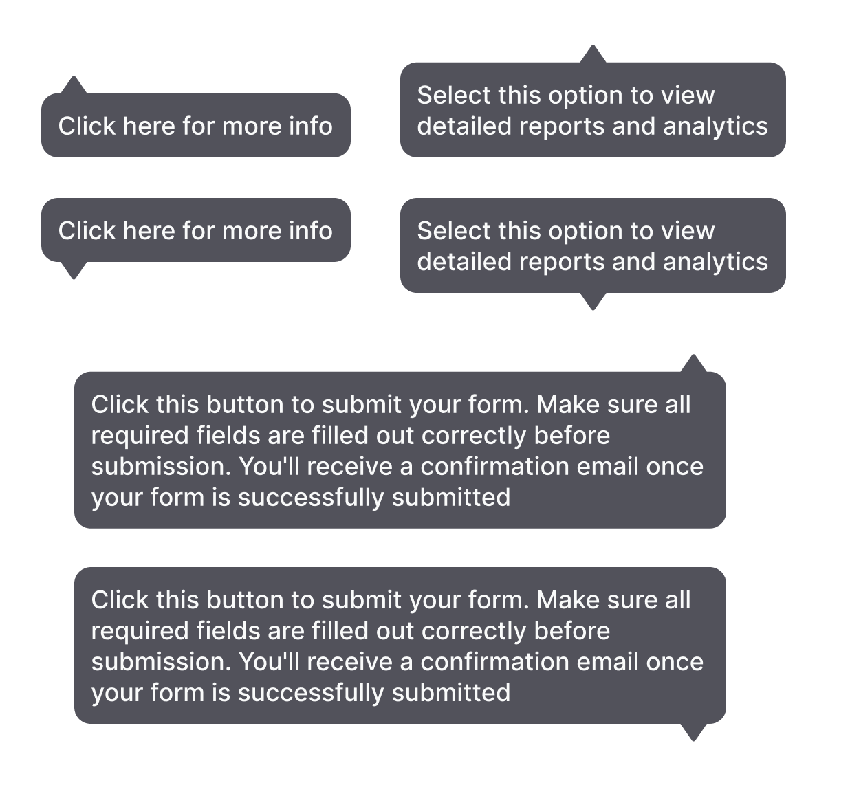
Tooltip Design Option 2
Option two retains all the same elements but offers an alternative color scheme and more rounded edges - in case they prefer a subtler, softer look compared to the teal. I left the final decision to the client, allowing them to choose the option that best fits their preferences.
Conclusion
Through a combination of research, design refinements, and usability improvements, Eqtble's platform was enhanced to deliver a more intuitive and user-friendly experience. By implementing a cohesive design system, improving navigation, and adding tooltips, we addressed key issues that would have previously caused confusion for users. The tooltips, in particular, were designed with accessibility in mind, offering flexible placement, responsive sizing, and optimal contrast for visibility. I also presented an alternative design with a more subtle color option, ensuring the client had choices that aligned with their vision. Overall, our goal was met to create a platform that supports users in easily accessing and understanding complex HR data, ultimately driving user engagement and satisfaction.