Growbie is a SaaS platform designed to foster community and cultural support among Asian-American students through curated educational bootcamps.

Overview
This project aimed to redesign the Growbie website for improved user experience and brand clarity. Our goal was to create a seamless, cohesive design that effectively conveyed Growbie's offerings while enhancing accessibility, readability, and navigation.
Role
UX/UI Designer
Team
1 Sr. Project Manager
4 UX/UI Designers
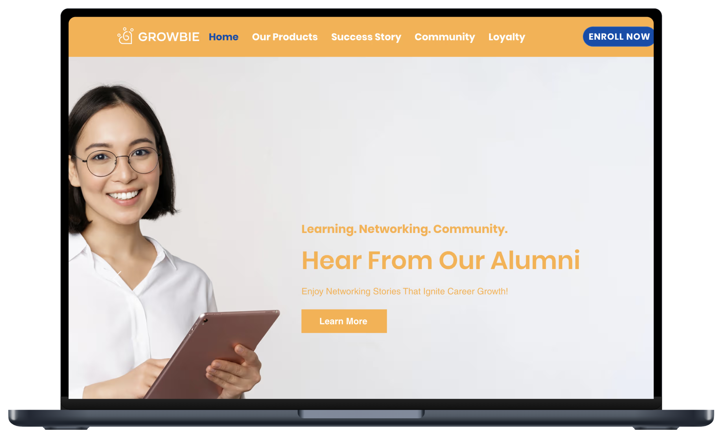
The original website had several usability issues that hindered user understanding and interaction. Problems included:
Contrast Issues: The brand's orange color, while essential, created contrast problems, especially with text and certain backgrounds, limiting accessibility.
Lack of Clarity and Flow: Users were unclear on what bootcamps were offered, where to navigate, and how to sign up. The information was not well-organized, leading to confusion.
Brand Consistency: The website’s style lacked a cohesive look and feel, diluting the Growbie brand.
Redundant Content: Repetitive information was scattered across the site, creating visual and cognitive overload for users.
Duration
5 Weeks
The Problem
Our Solution
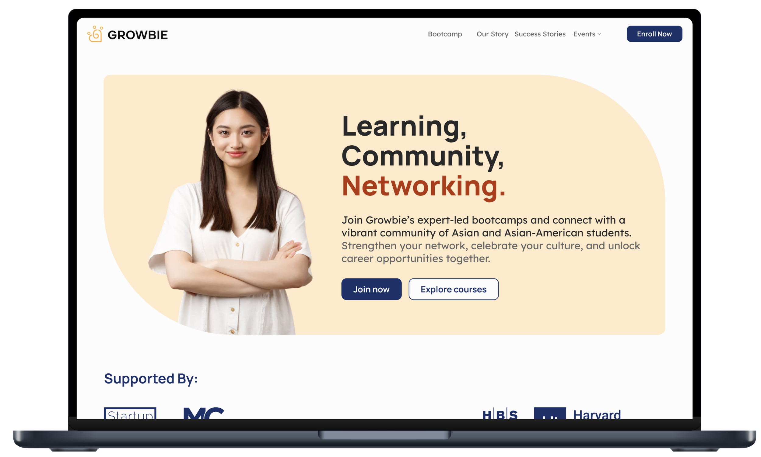
Our redesign addressed these issues by introducing a more structured layout, improving contrast and readability, and clarifying the content. We built a clean, visually engaging site that communicates Growbie’s values and services at a glance. Key solutions included:
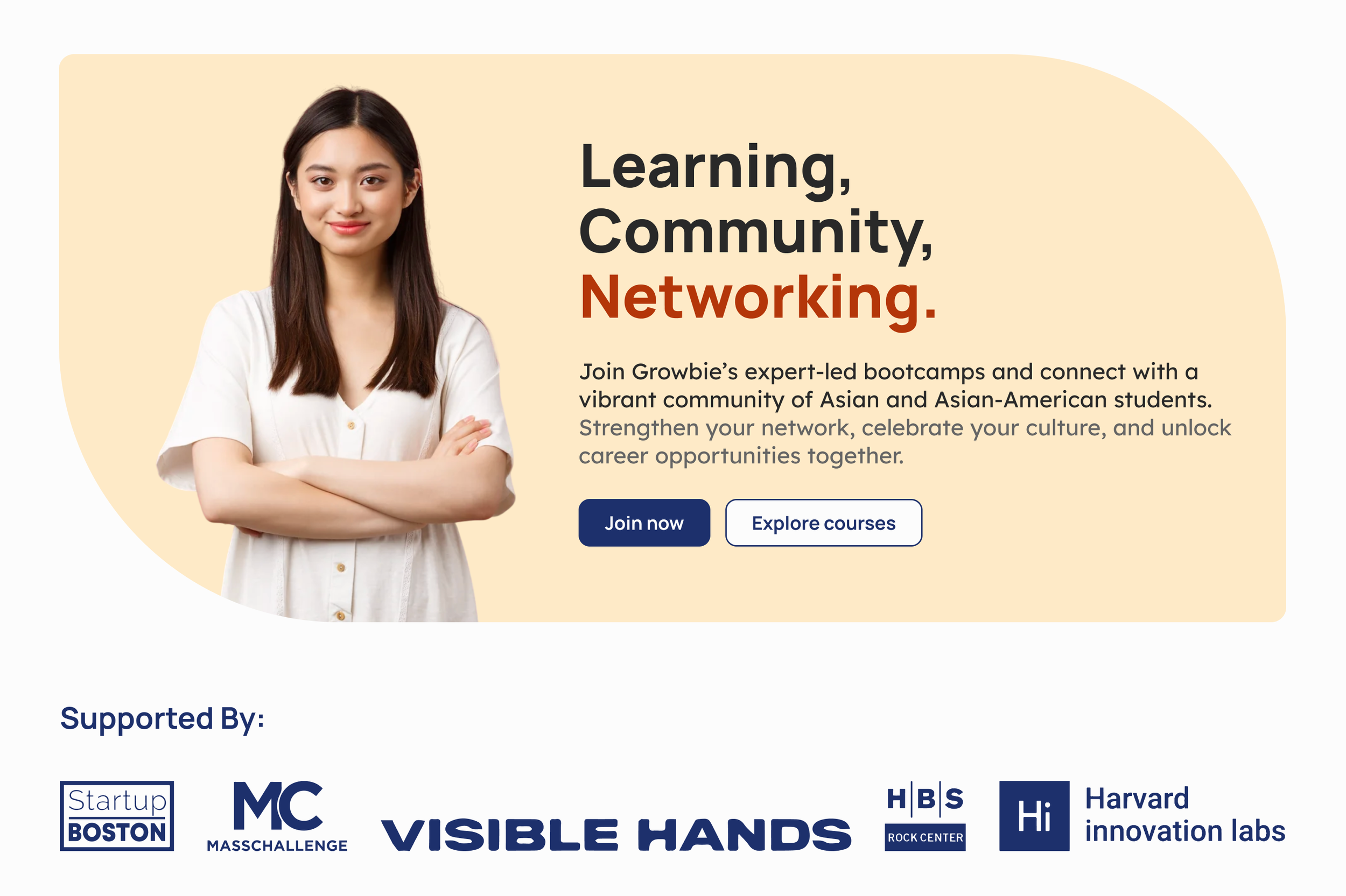
Providing an alternative color scheme with blue to mitigate contrast issues.
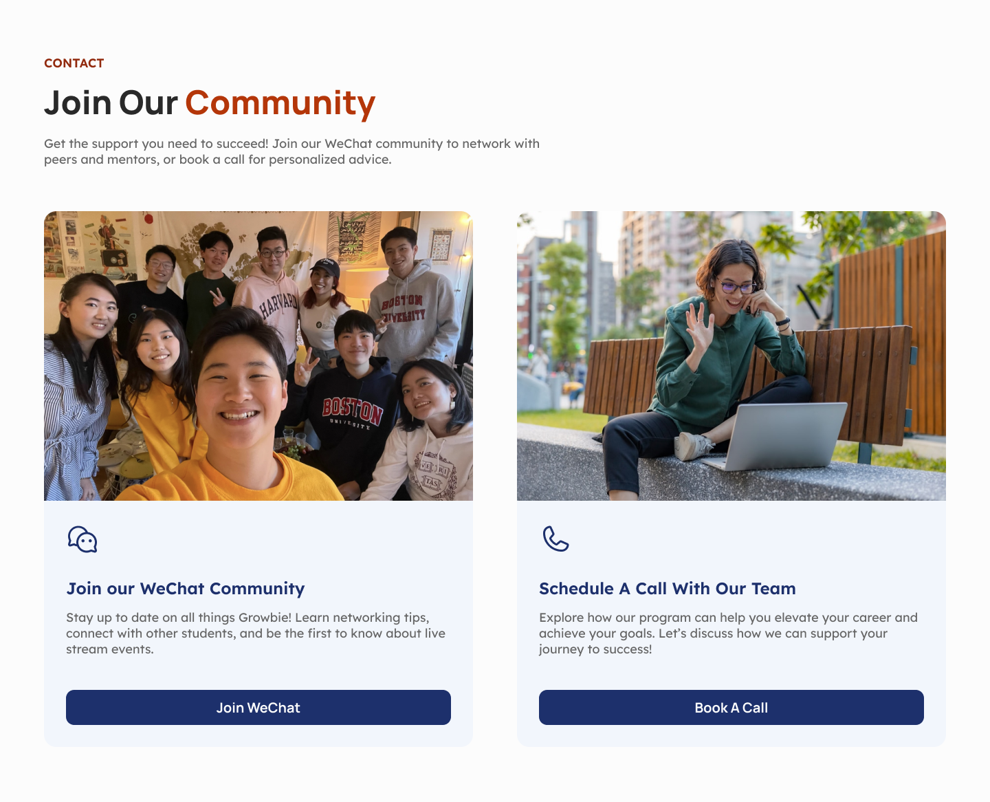
Restructuring the HERO sections to establish a clear introduction to Growbie’s bootcamps and mission.
Consolidating and streamlining redundant content for a smoother user journey.
Developing a responsive design for mobile and tablet to reach users on any device.
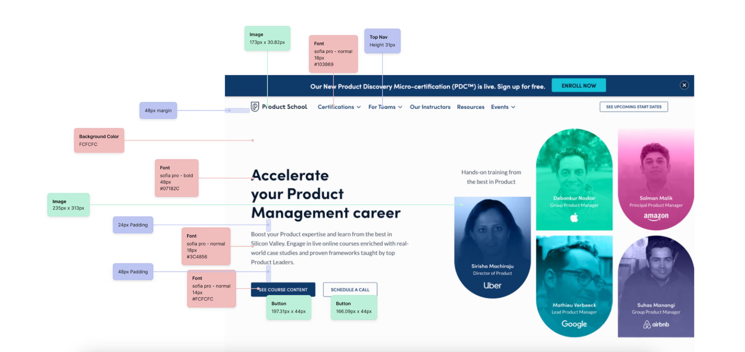
Competitive Analysis
We began with a competitive analysis, assessing similar educational and cultural bootcamp sites to understand best practices. This insight informed our decisions on layout, typography, and content prioritization, setting a benchmark for achieving high usability and brand appeal.
Then we switched back and reviewed Growbie’s original site, we found multiple areas for improvement:
Inconsistent Flow: Key information was hard to locate, and the navigation lacked a logical structure.
Unclear Branding: The tone and style did not cohesively represent Growbie's purpose or audience.
Accessibility Challenges: The orange that was chosen and different images created difficult-to-read text and low contrast, limiting the experience for users with visual impairments.
Overwhelming Information: The FAQ and other sections were cluttered and redundant, making it hard for users to find answers quickly.
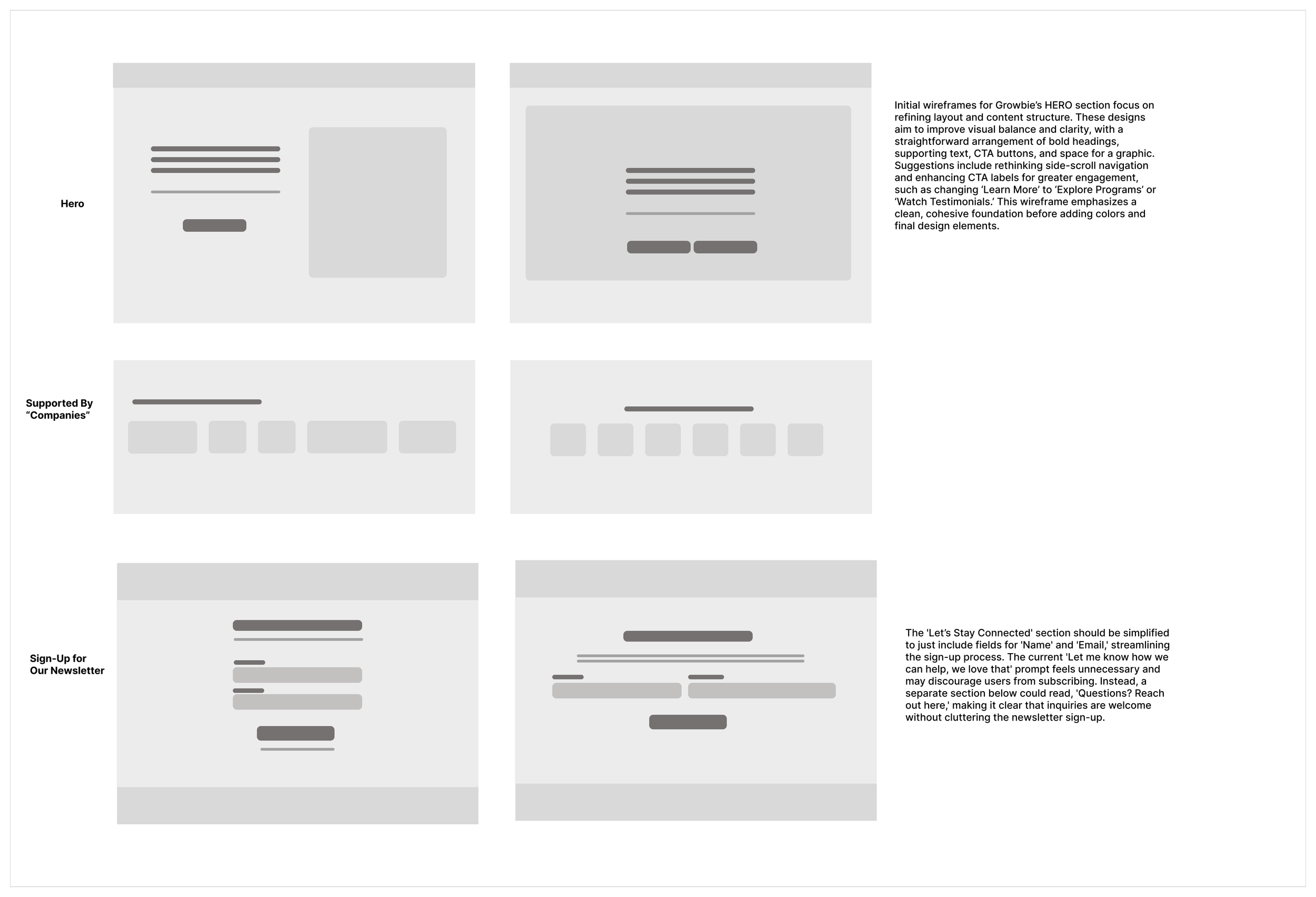
Wireframing
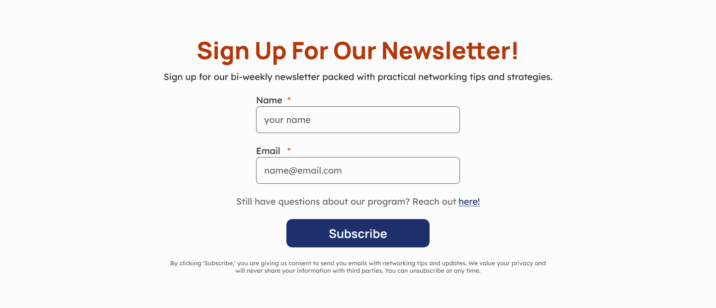
Based on our initial findings, we created wireframes for the homepage, bootcamp pages, and FAQ section. The focus was on structuring the information clearly, with designated areas for key content such as bootcamp details, testimonials, and calls-to-action. My main focus was the hero (containing a section with companies that support them) and the newsletter sign up.
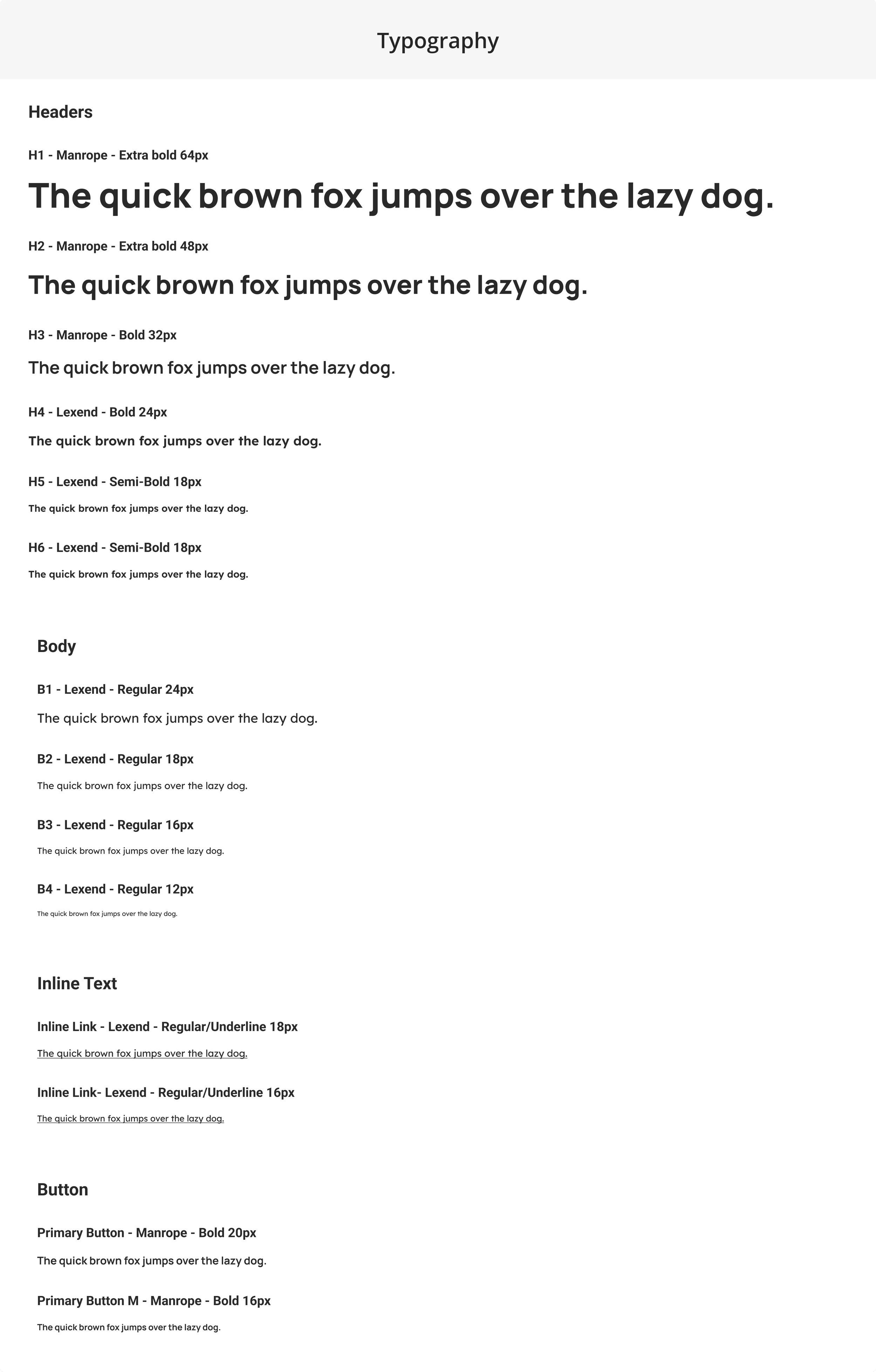
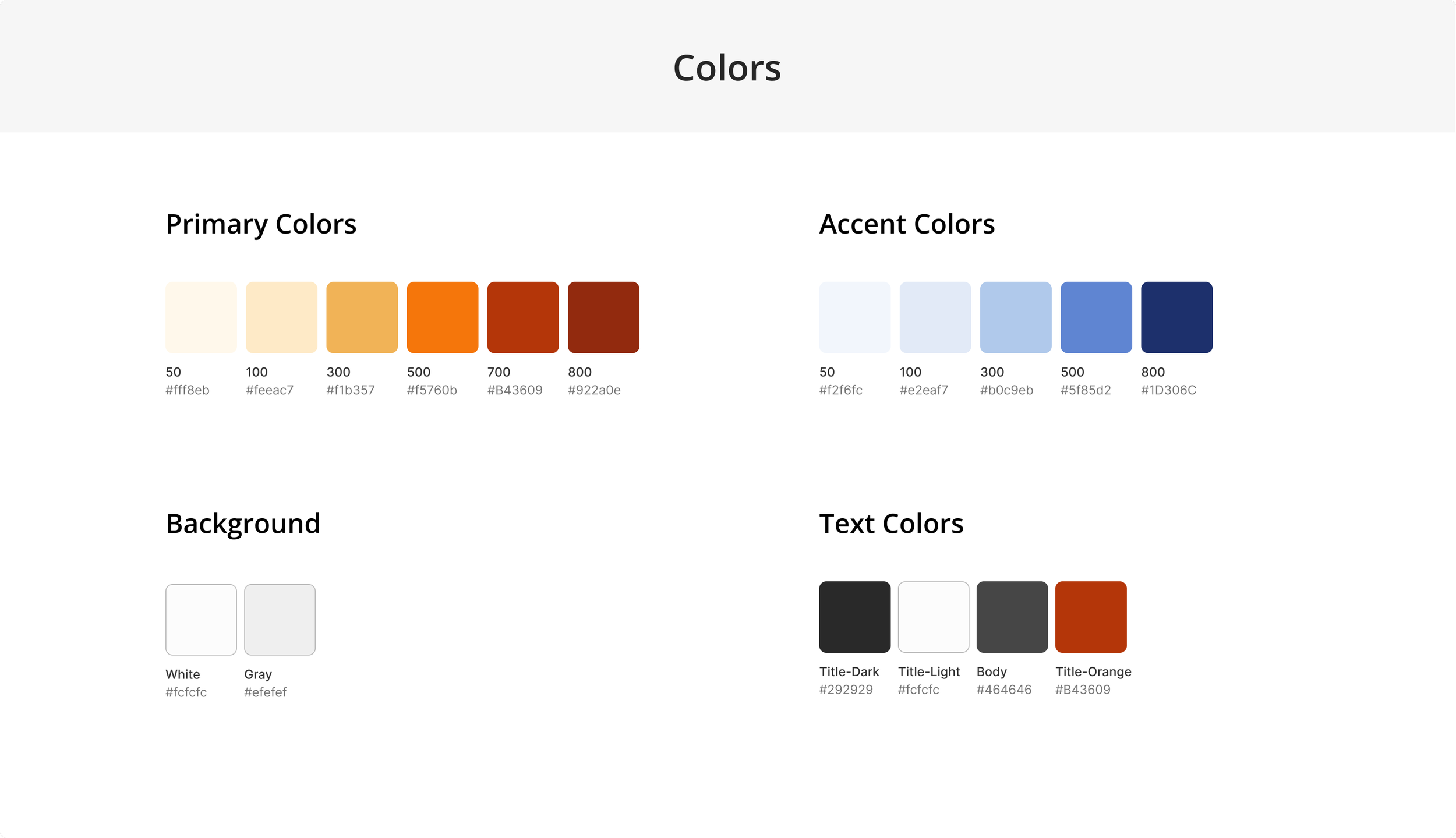
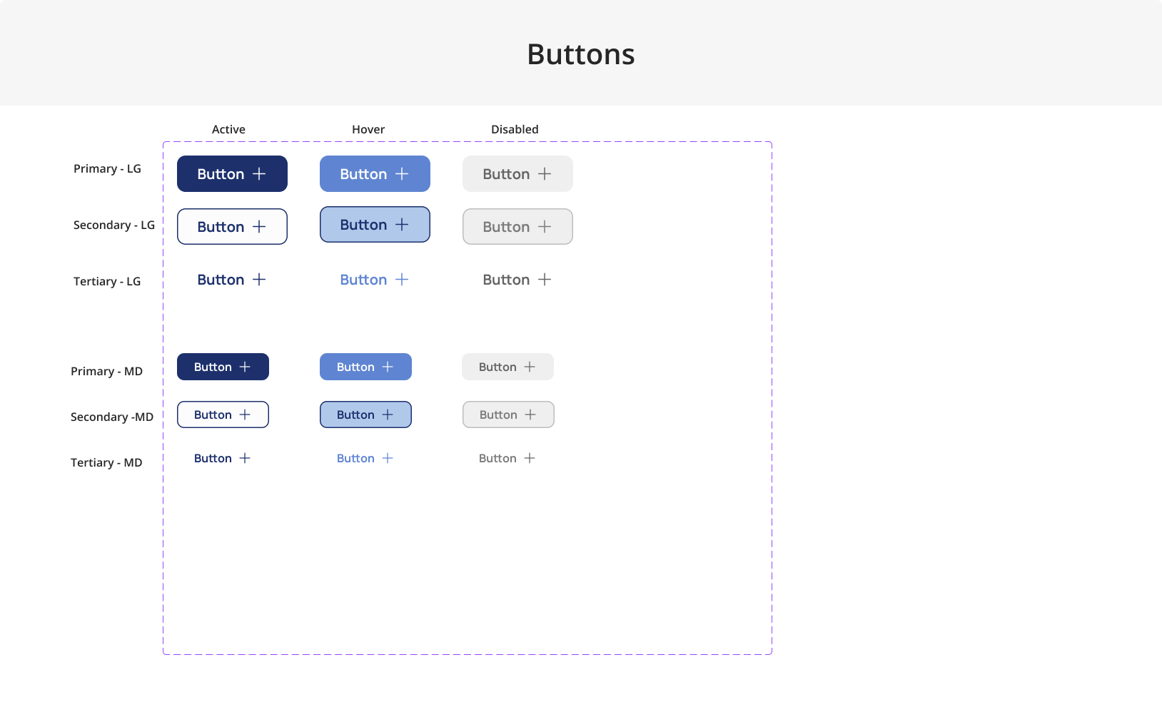
Design System & Style Guide
To create consistency, we developed a comprehensive style guide that defined typography, color usage, and button styling before we moved onto hi-fis, that way while we were all desiging separately it could still feel conhesive in the end.
Color Scheme: Due to contrast concerns with the brand's orange, we offered a blue-based scheme with orange accents to improve readability while keeping the brand intact.
Typography Choices: We selected legible fonts that align with Growbie’s professional yet friendly tone.
Iconography and Imagery: We used icons and images that reflect Growbie’s educational focus and cultural emphasis.
Design Iterations
Throughout the process, we iterated on several design elements:
Contrast and Readability: Testing various backgrounds and font colors to meet accessibility standards.
Section Refinements: Ensuring that each section clearly communicated the core purpose of each page, with an engaging layout and actionable content.
Navigation Updates: Simplifying and reordering the menu for a more intuitive structure.
Final Design
To showcase our progress, we present a comparison of the original and redesigned pages. Highlights include:
Brand Consistency
We were mindful of retaining Growbie’s identity by preserving the orange where possible and incorporating elements that reflect the brand’s mission. Every design choice was aligned with Growbie's goal to support Asian-American students, with an emphasis on cultural sensitivity and community.
Clarity and Redundancy Reduction
To eliminate redundancy, we consolidated information and revised the FAQ section for clarity. This provided a streamlined experience, guiding users to key content without unnecessary repetition.
Clear Hierarchy
A clear visual hierarchy was essential to improve navigation and user understanding. We structured each page so that key elements, such as HERO sections, headings, and CTAs, stood out prominently. This hierarchy helped direct users’ attention to primary information first, followed by supporting details. Organizing the content by importance improved both readability and engagement, making the overall experience more intuitive.
Responsive Design
Our final design was responsive, with tailored layouts for mobile and tablet screens. This ensured that users could easily access Growbie’s content on any device, expanding the reach of their programs.
Final Designs
Conclusion
Our redesign of the Growbie website made significant improvements in accessibility, branding, and user experience. By resolving contrast issues, improving the site’s flow, and clarifying information, we created a user-friendly platform that supports Growbie’s mission to empower Asian-American students.